01 From Insight to Visual System
01 From Insight to Visual System
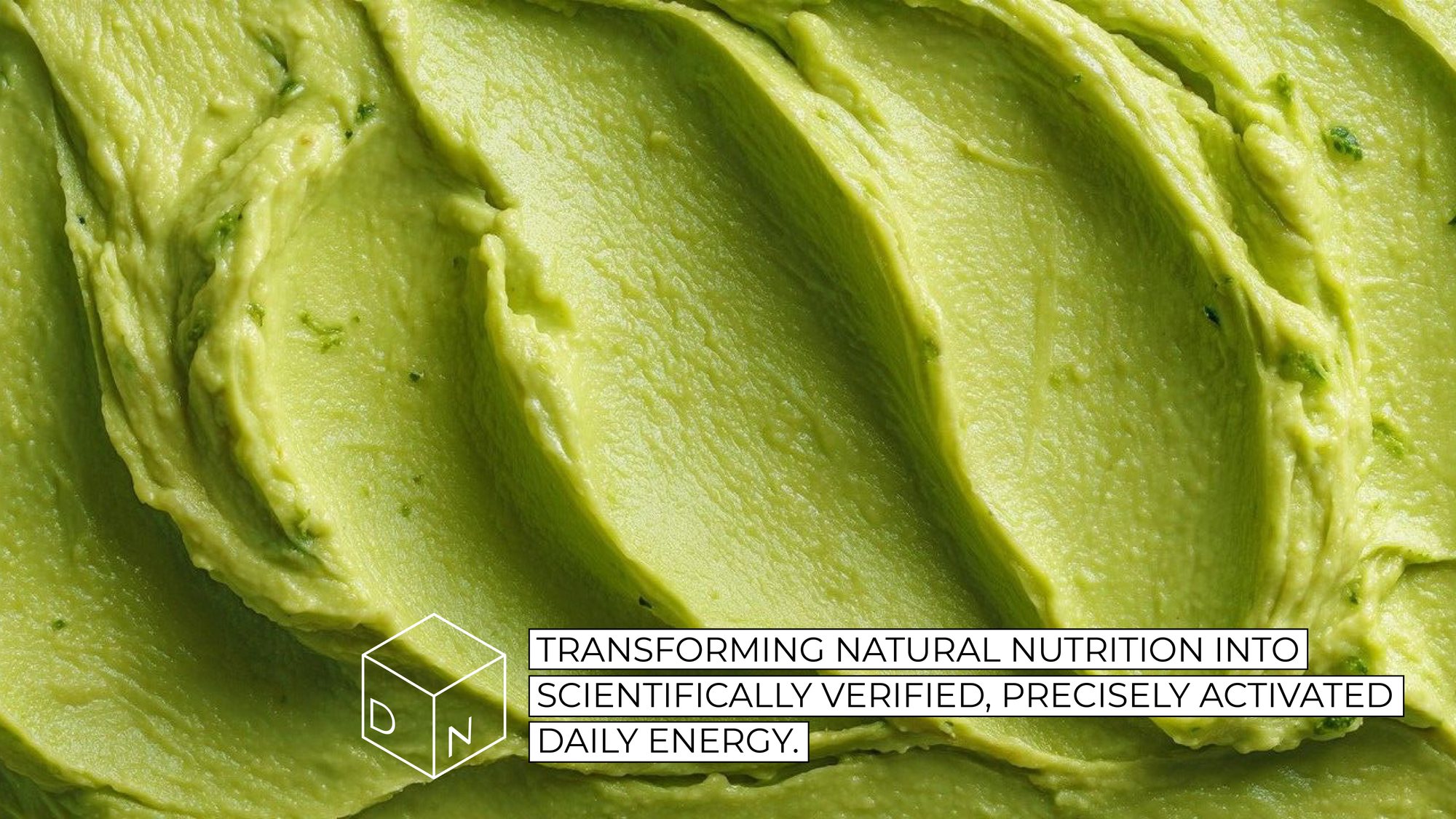
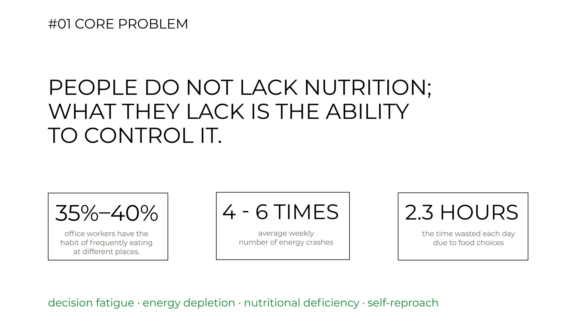
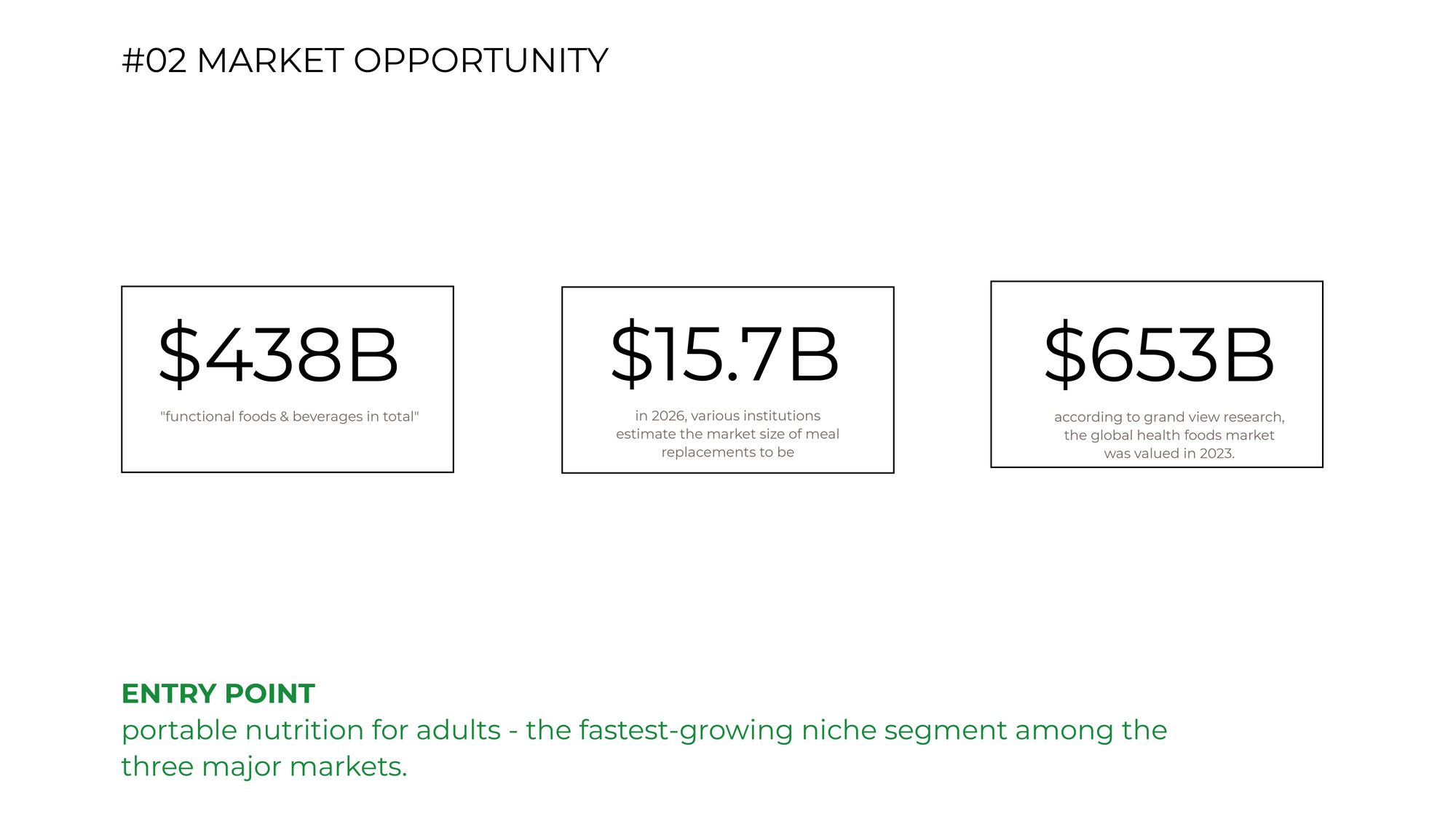
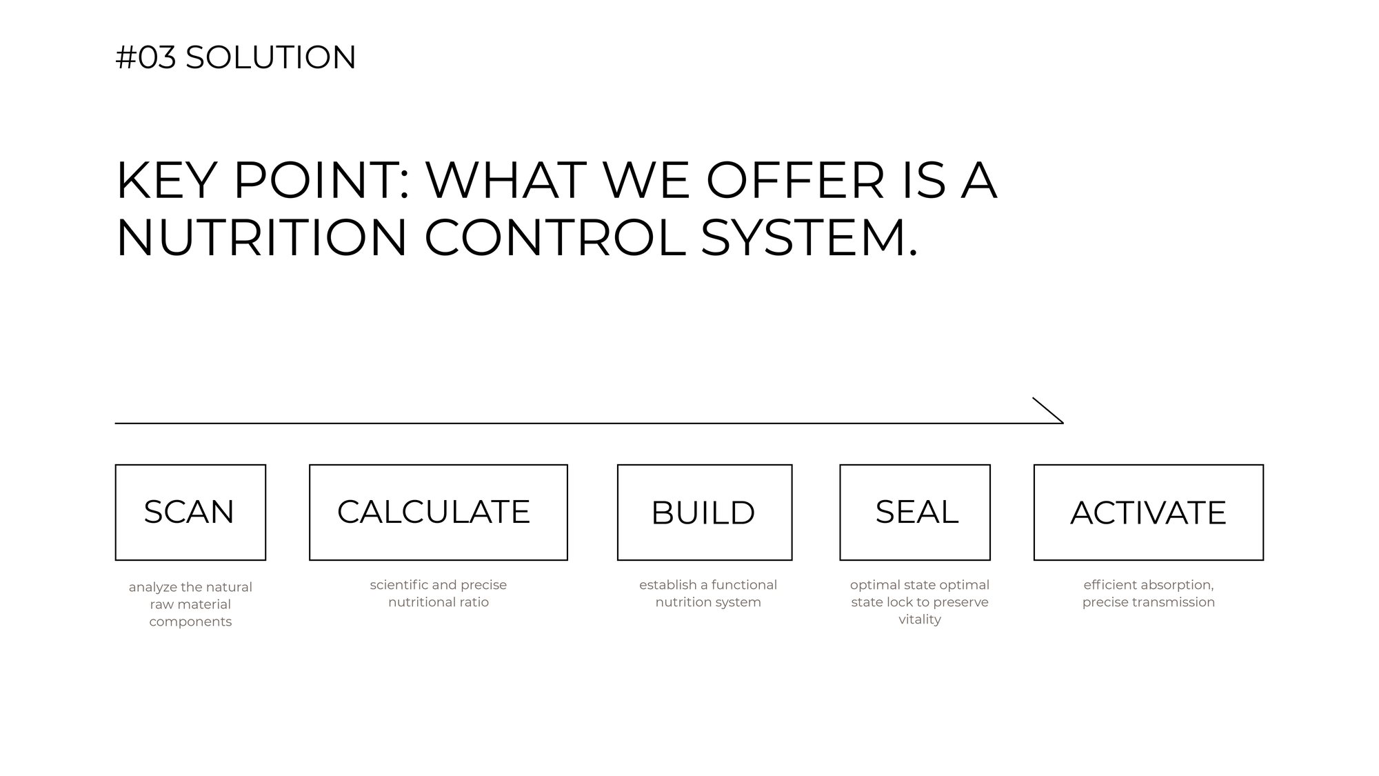
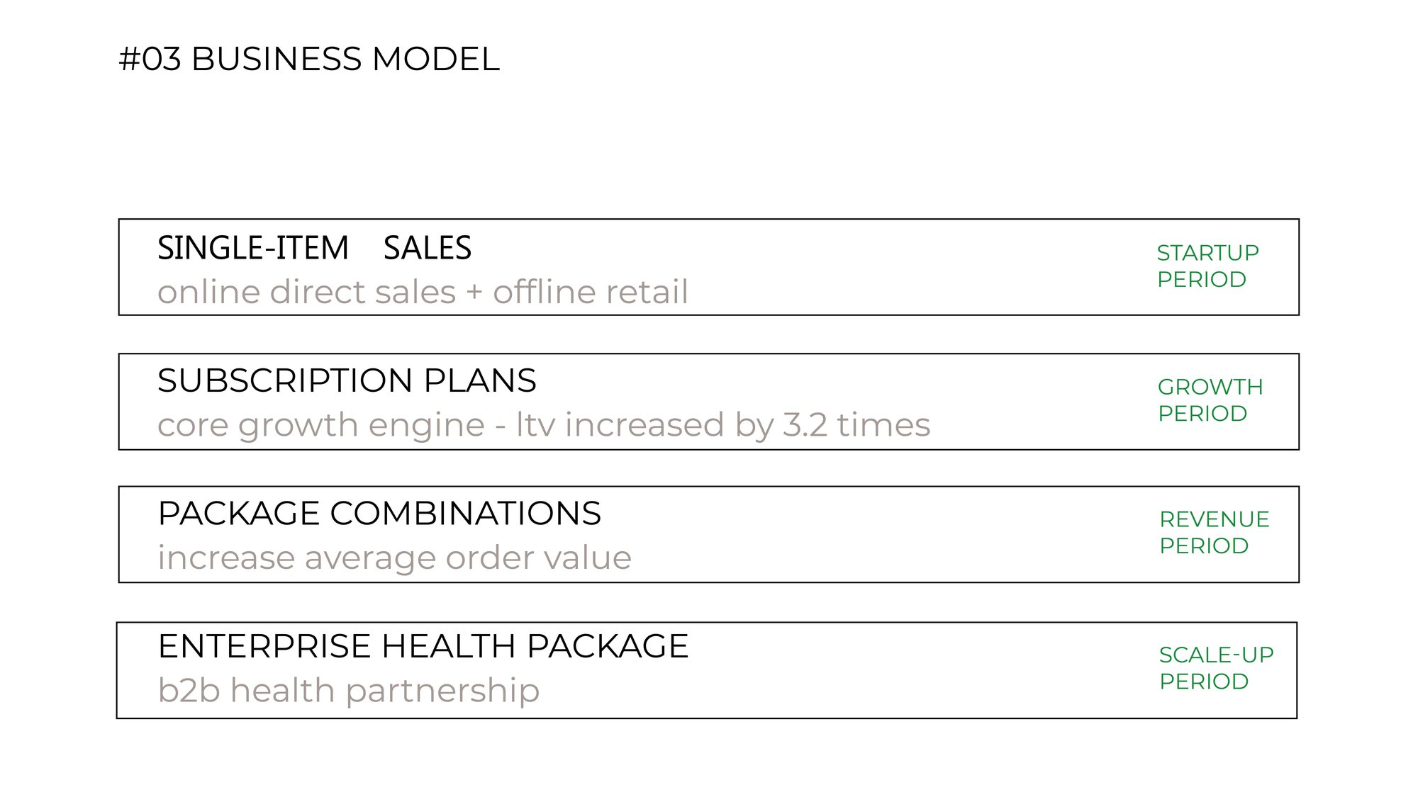
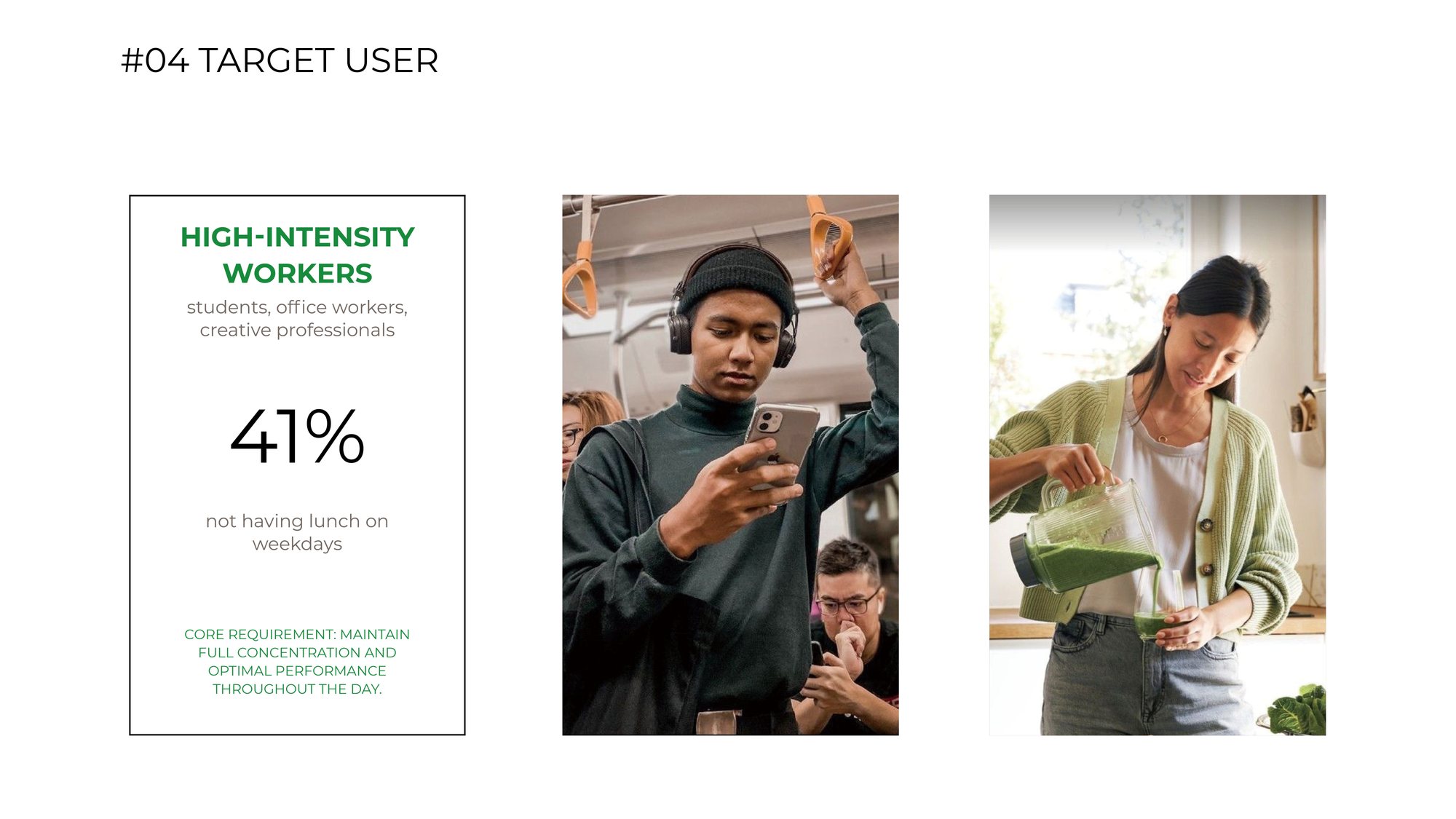
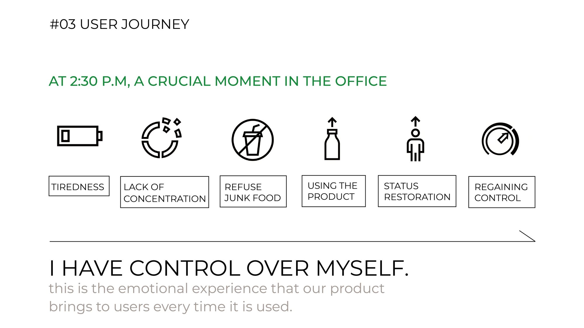
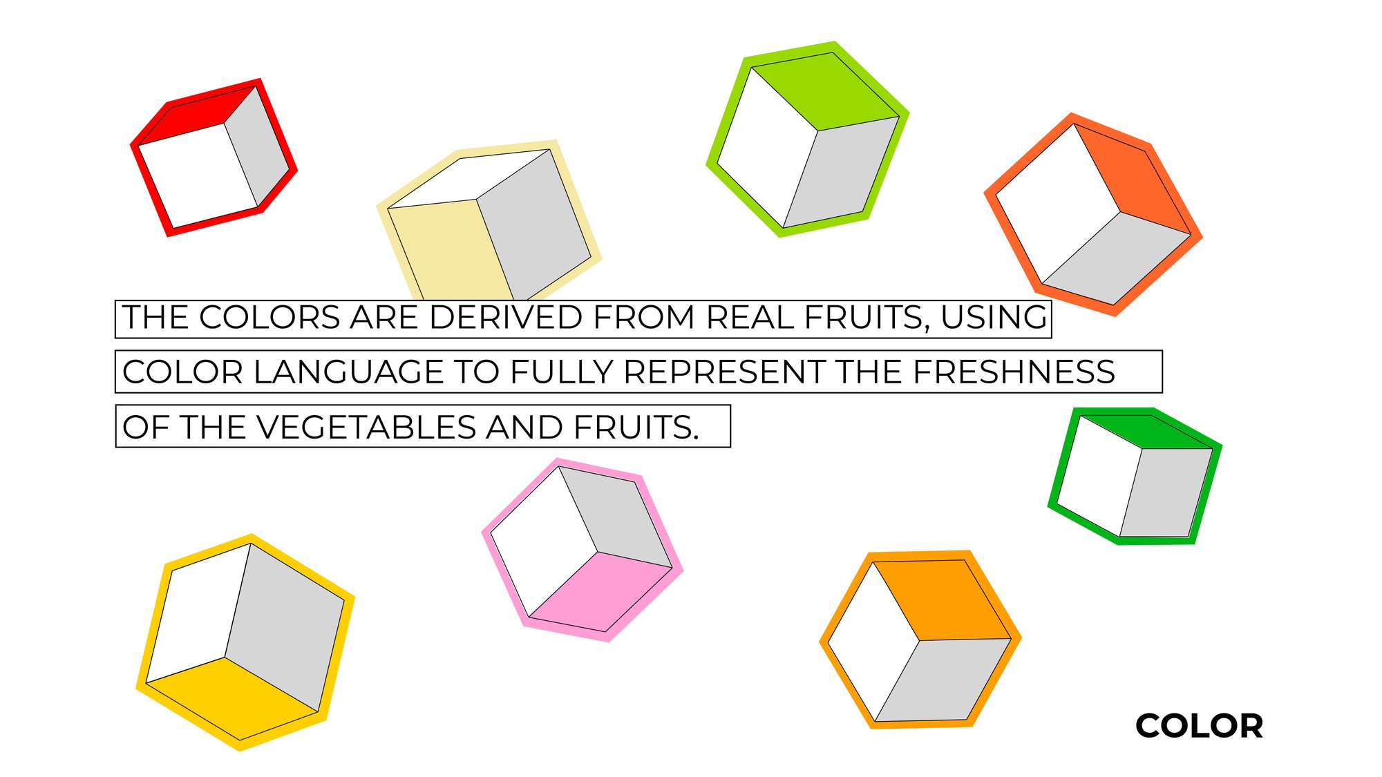
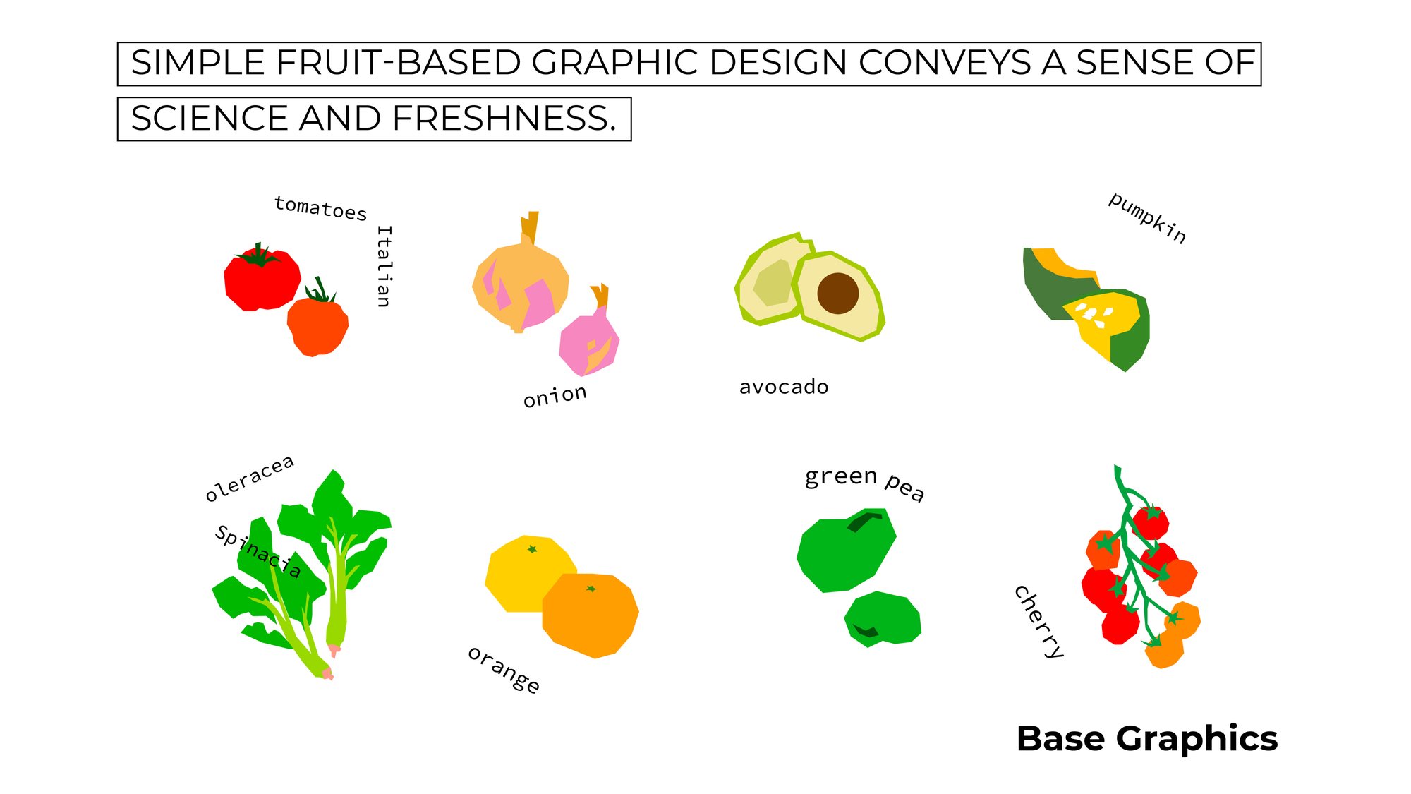
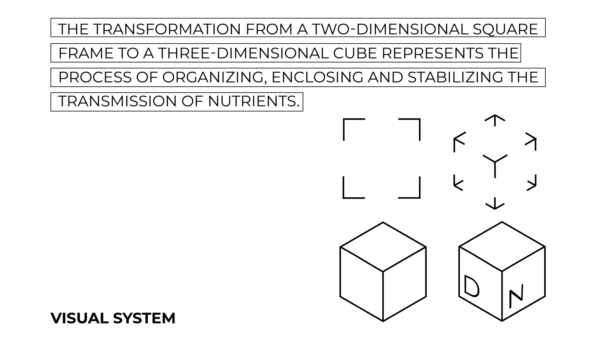
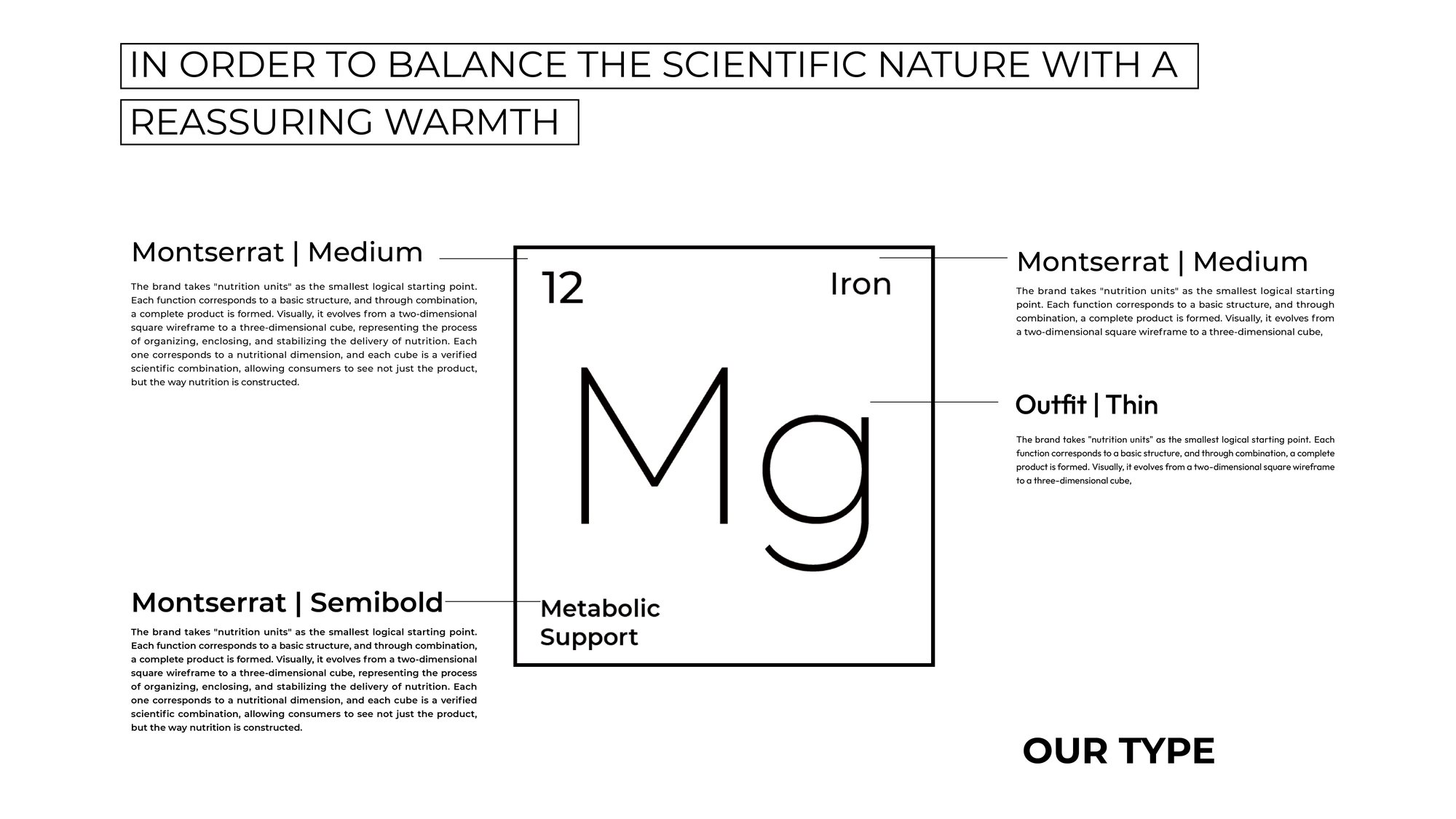
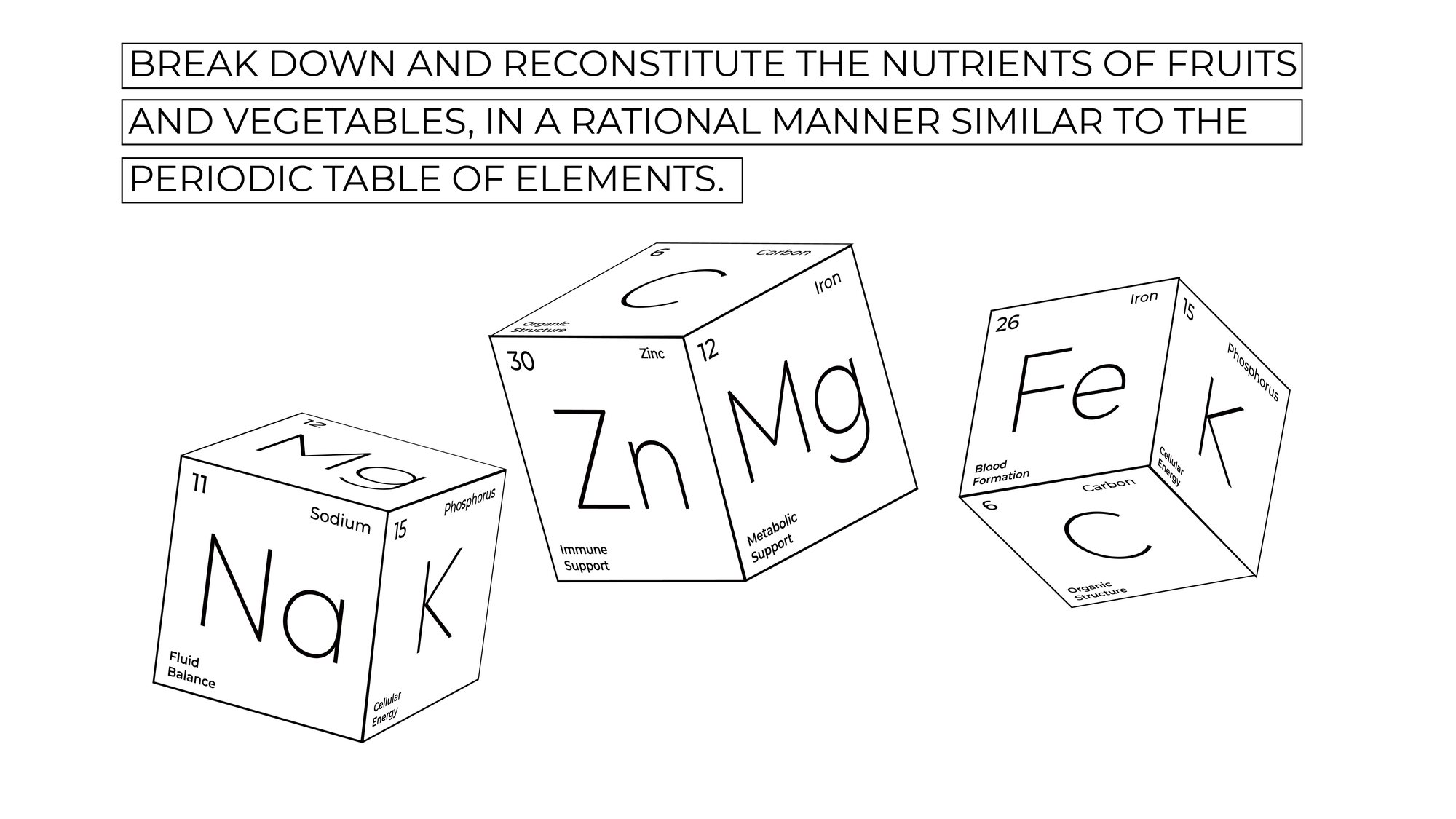
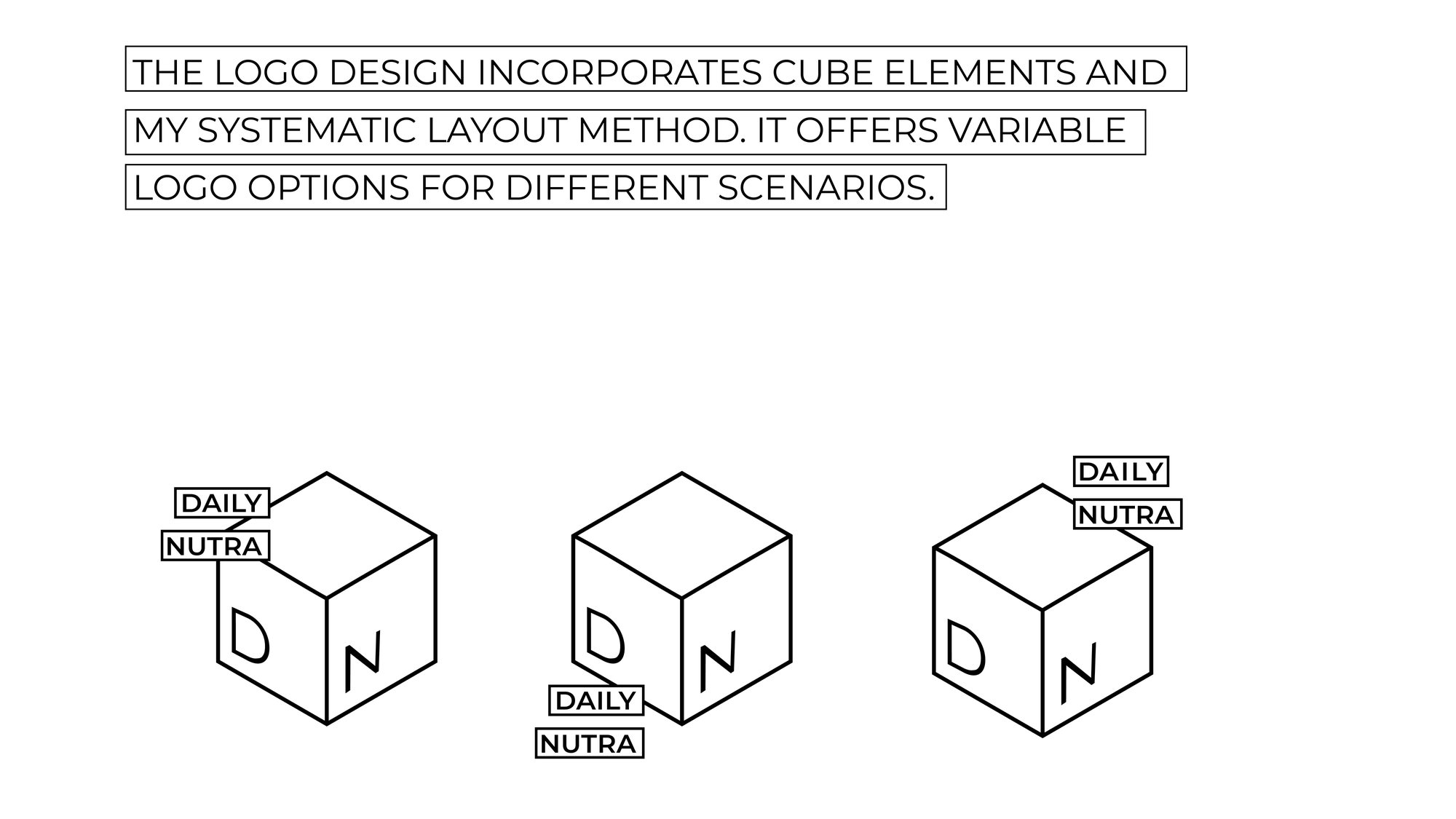
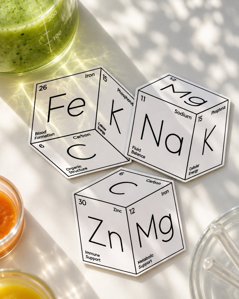
User research showed that people are busier than ever and struggle to get the nutrition they need from everyday meals, which pointed to a gap for a new product. I studied user data and the market opportunity, mapped the target users and their journey, and built this fictional brand through journey maps, a business model and a business plan. Alongside it I built a visual system: taking the periodic table as a starting point, nutrients become visual symbols that grow from 2D wireframes into 3D forms, and from there into the logo and brand graphics.
02 Product Rendering
Packaging
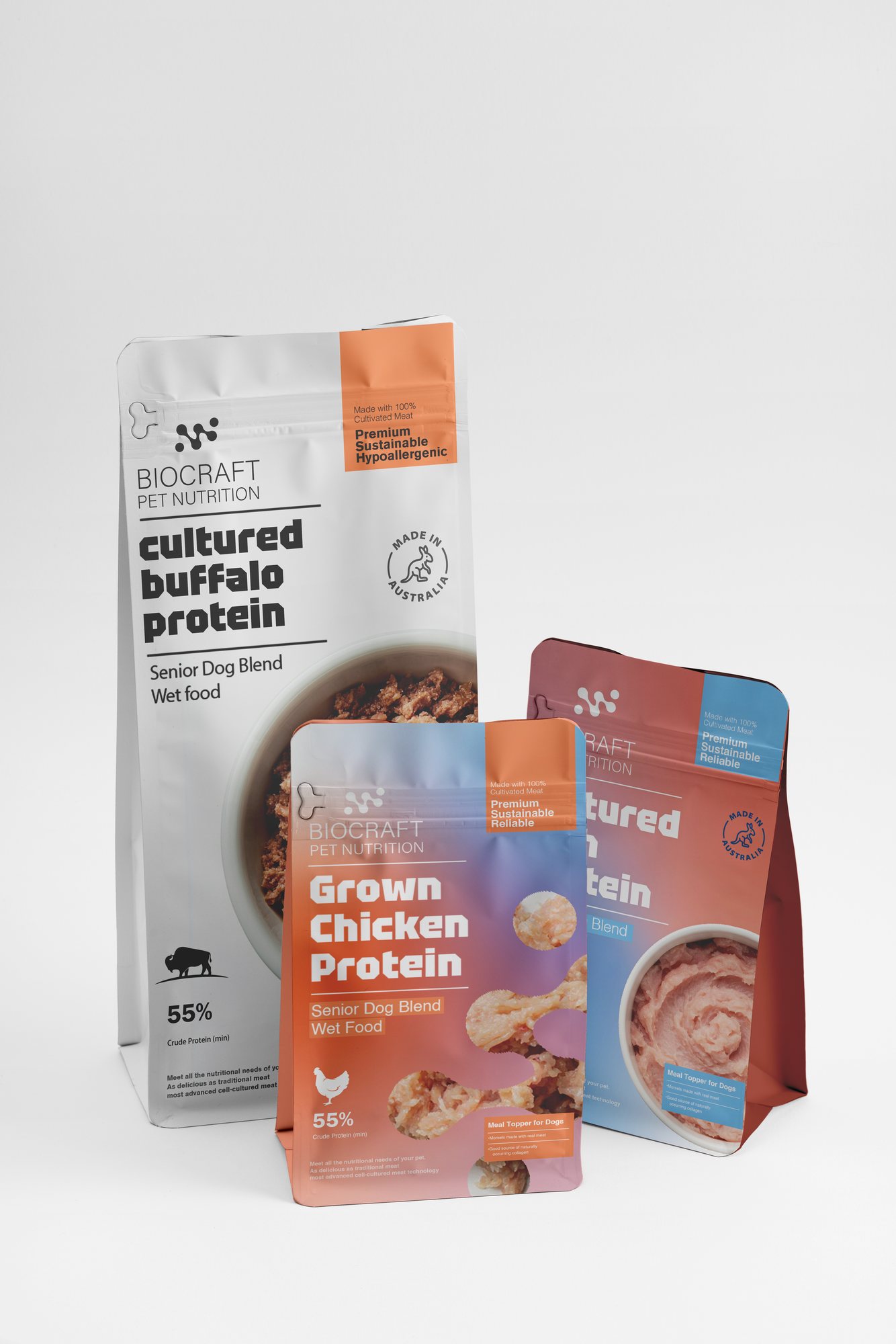
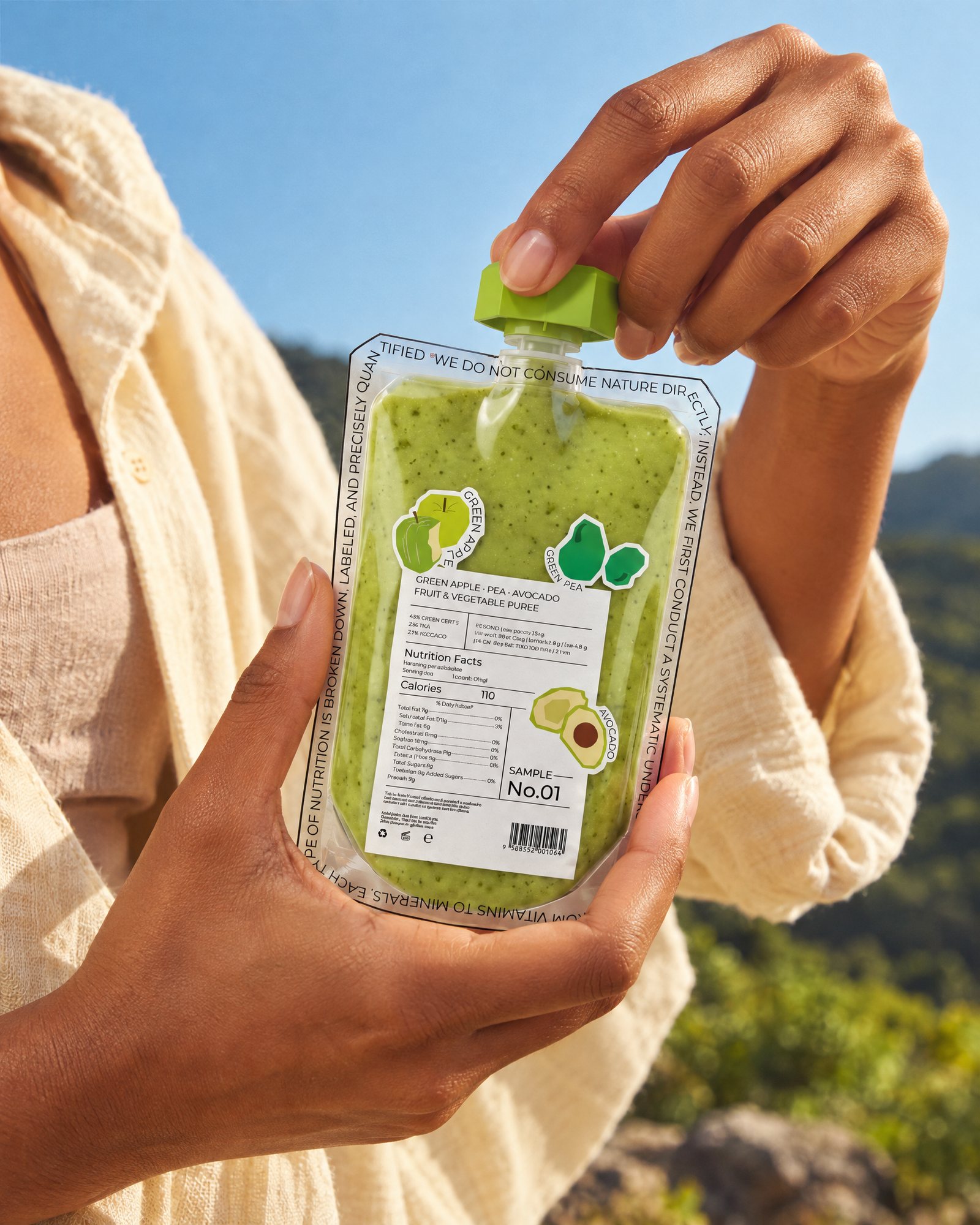
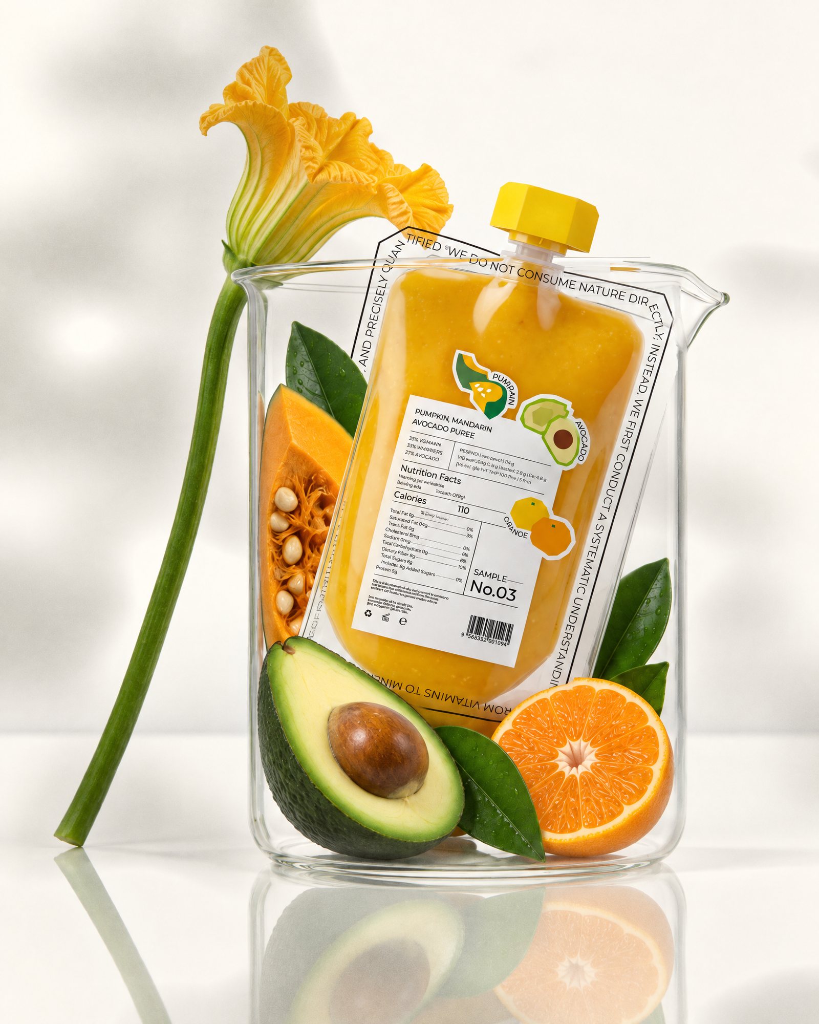
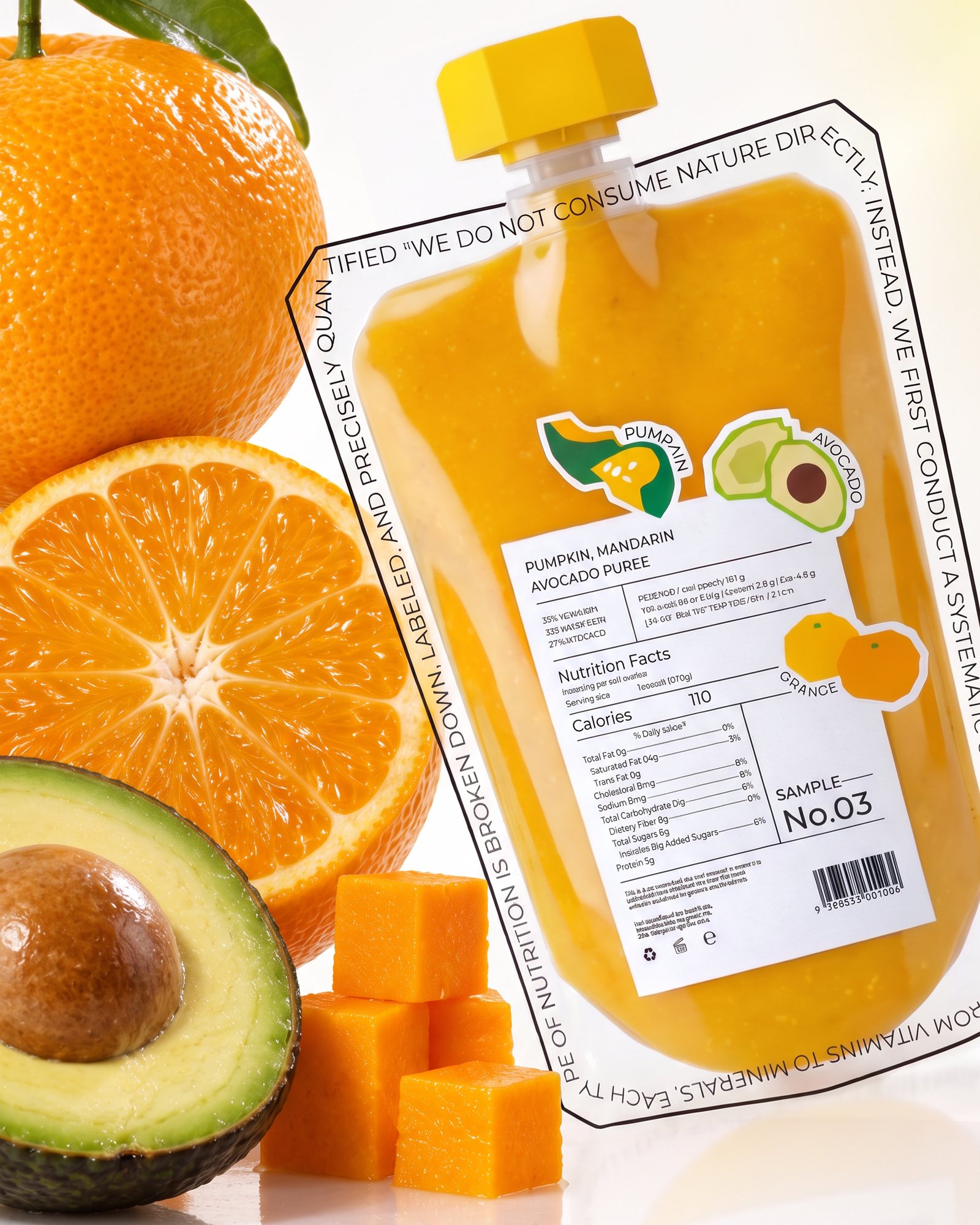
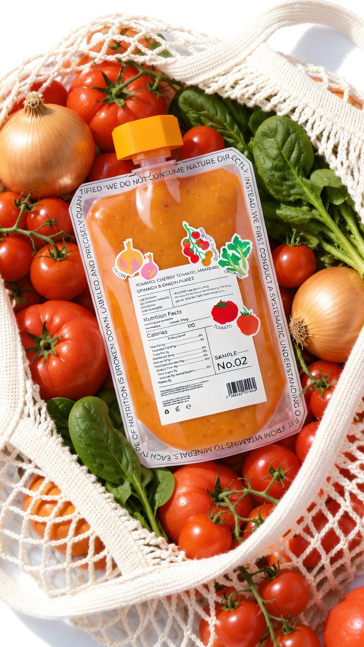
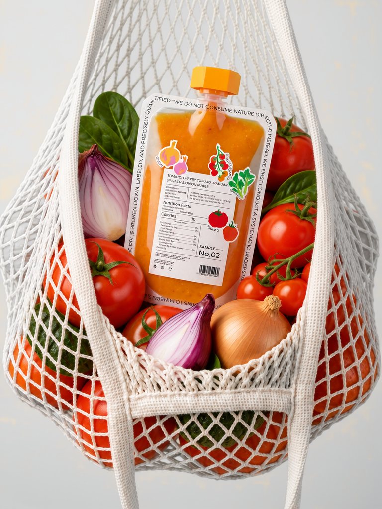
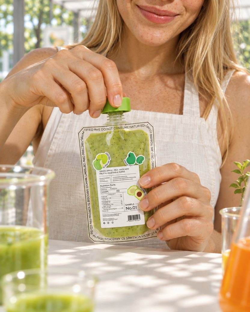
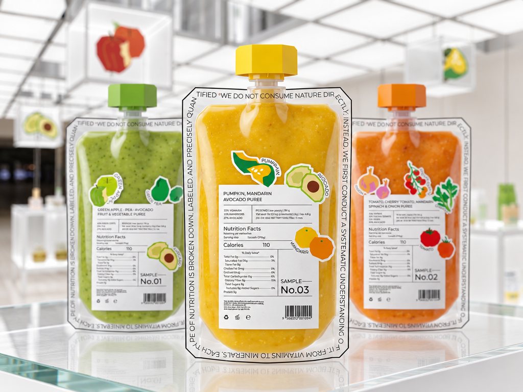
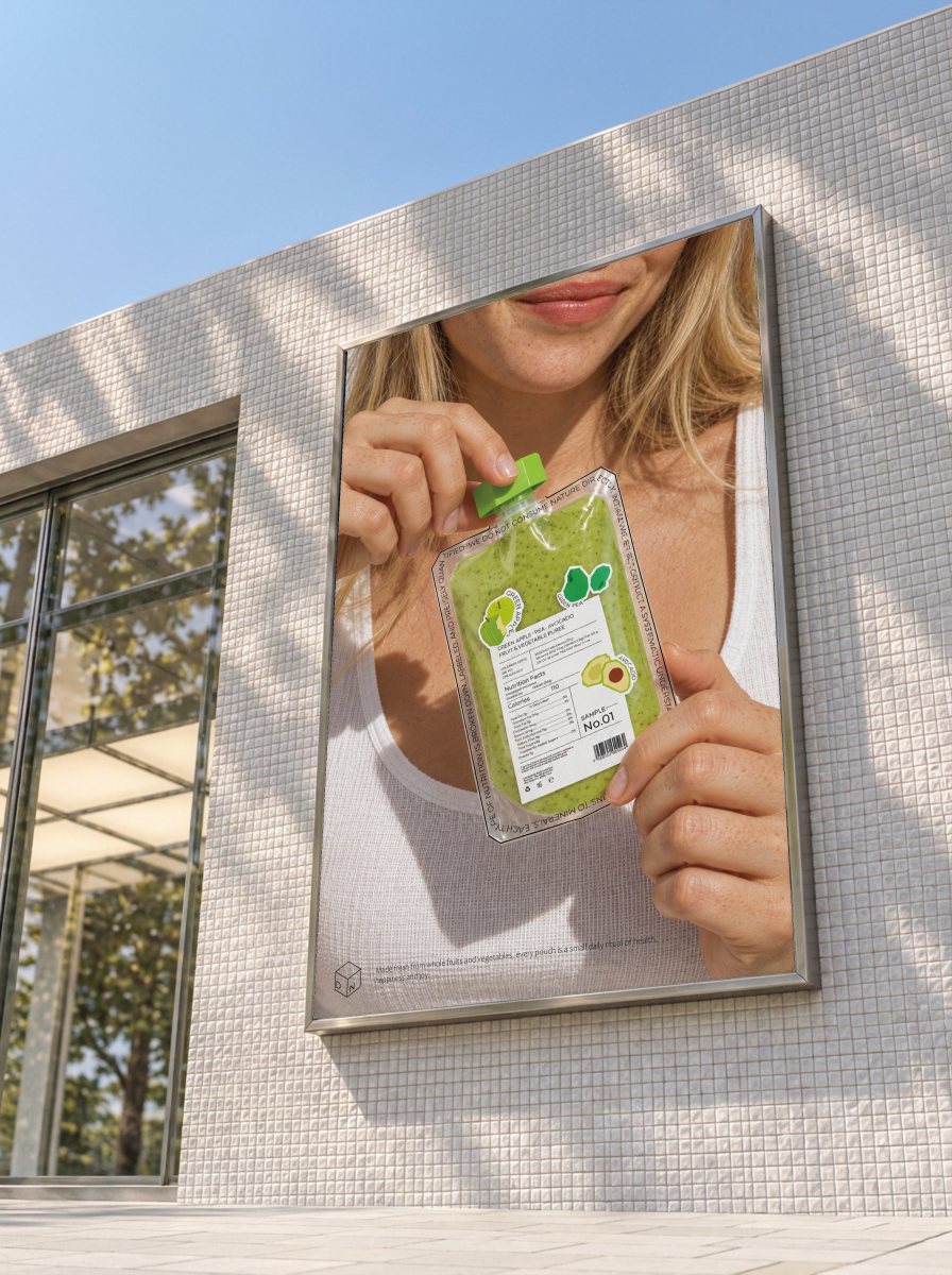
The packaging keeps the brand's restrained, rational tone while feeling fresh and lively. A clear pouch shows the texture of the purée at a glance, and a label laid out like a laboratory tag makes the ingredients and nutrients easy to read, for a calm, trustworthy feel. The brand steps away from the conventional, with an avant-garde yet easy, cheerful character that every layout follows. The cap keeps the edges of the cube, and the ingredient stickers stay clearly visible on the pack.
Product Renders
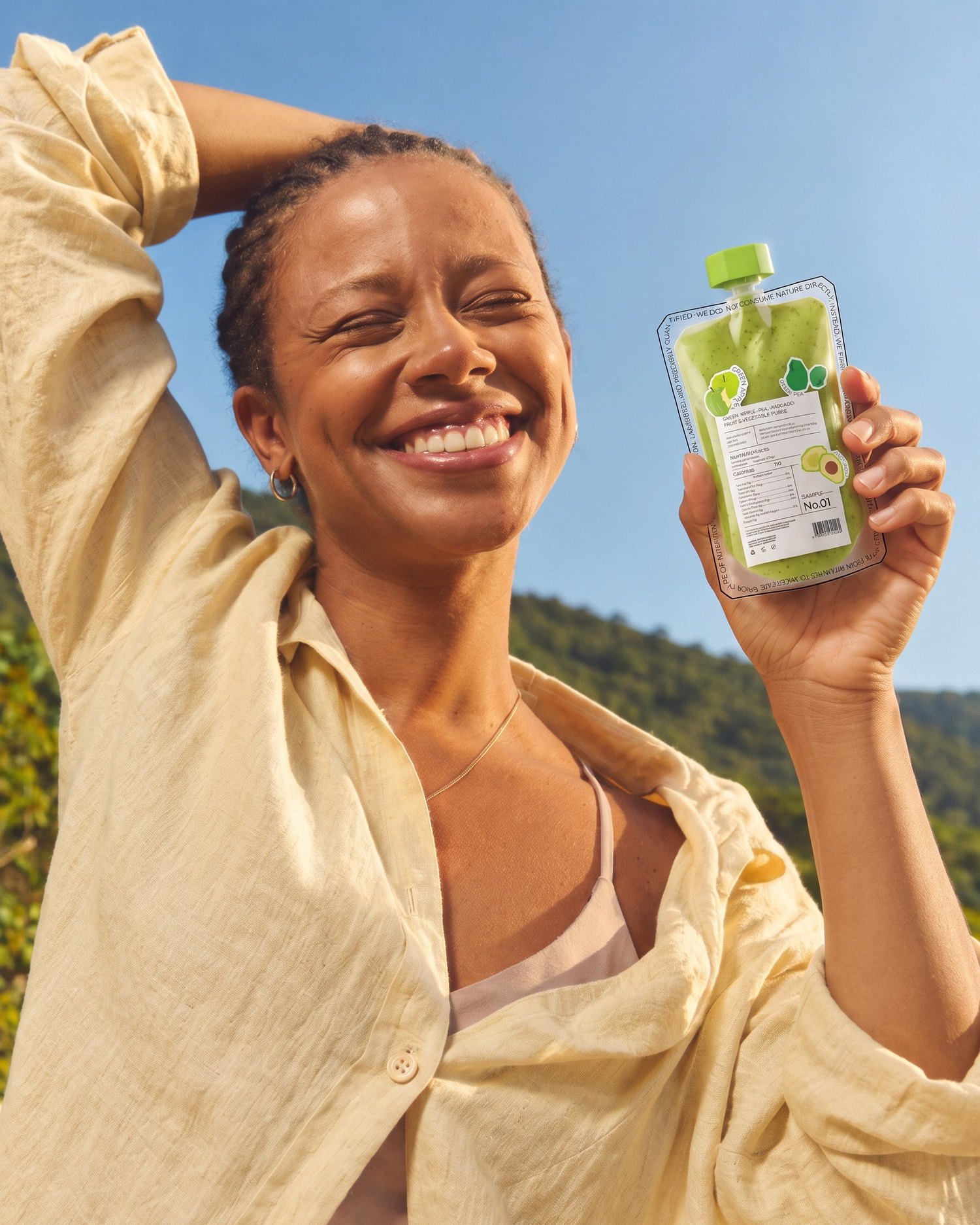
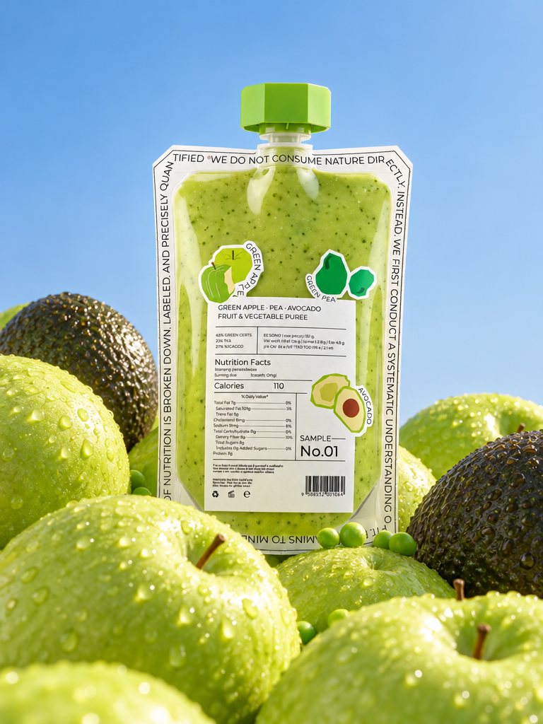
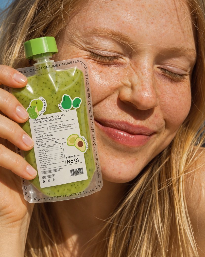
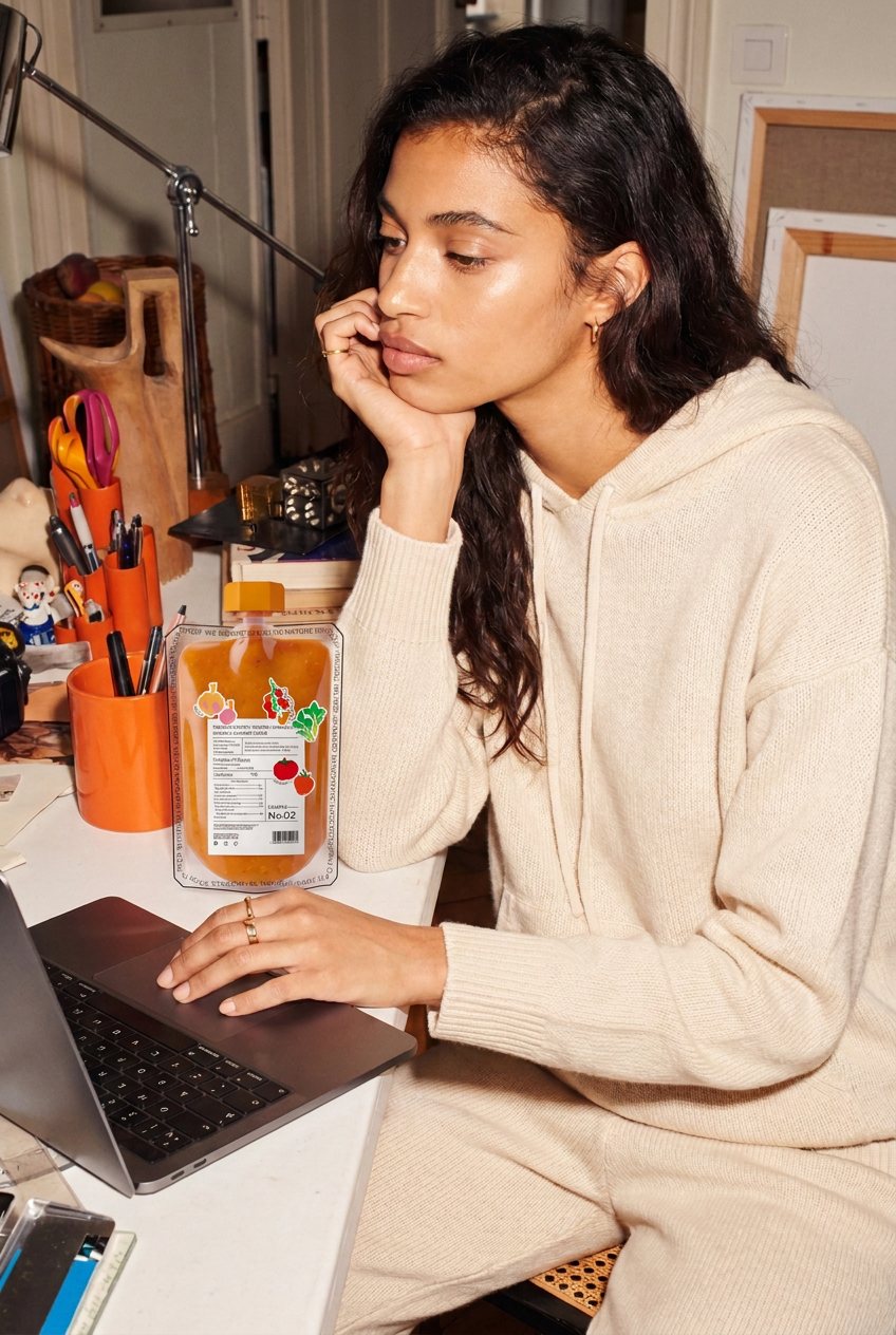
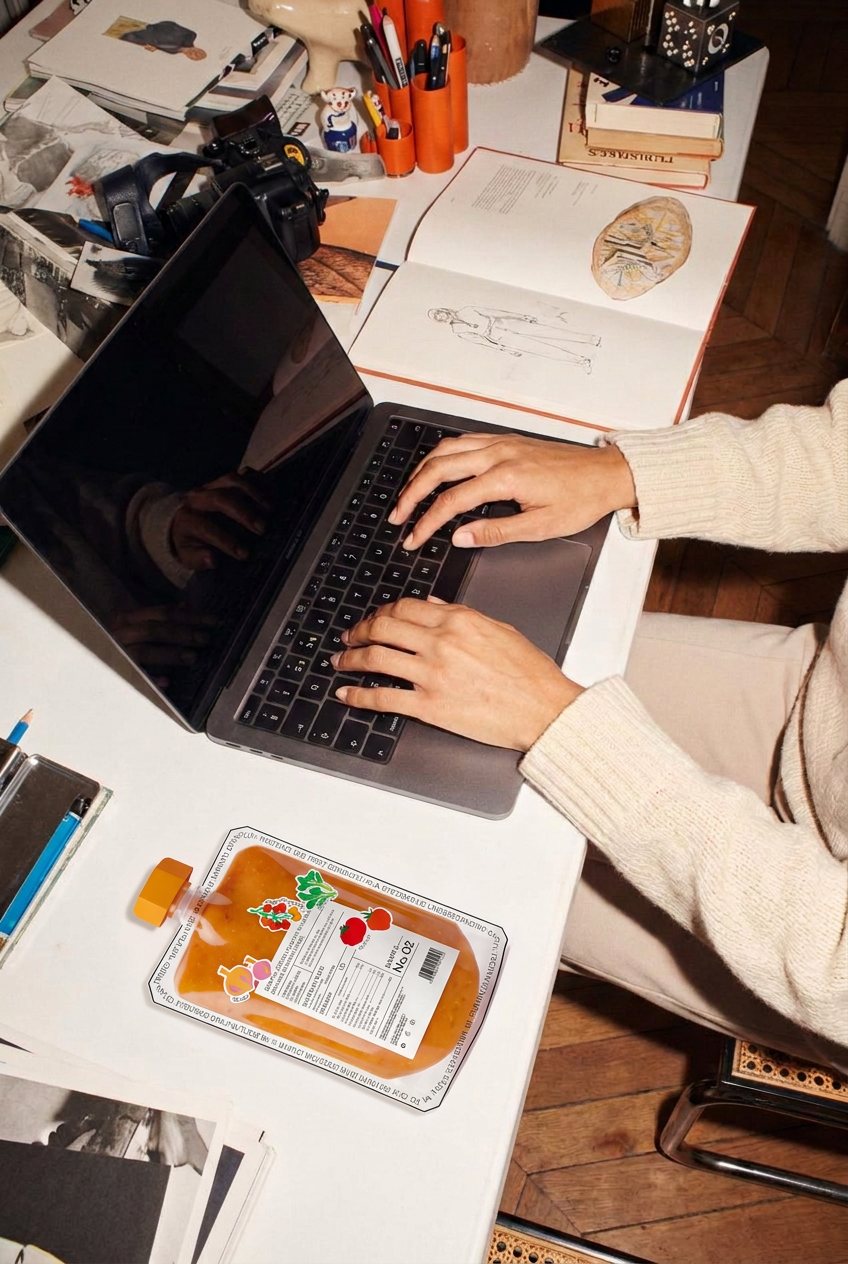
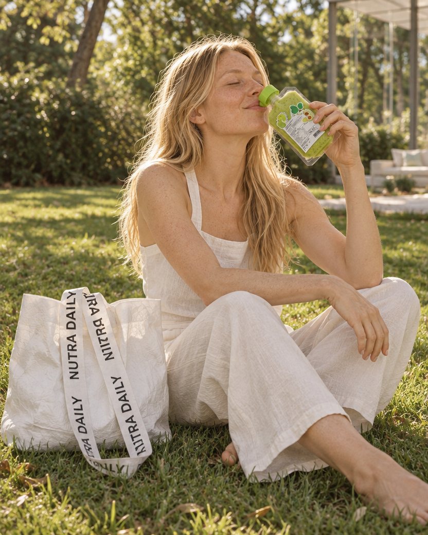
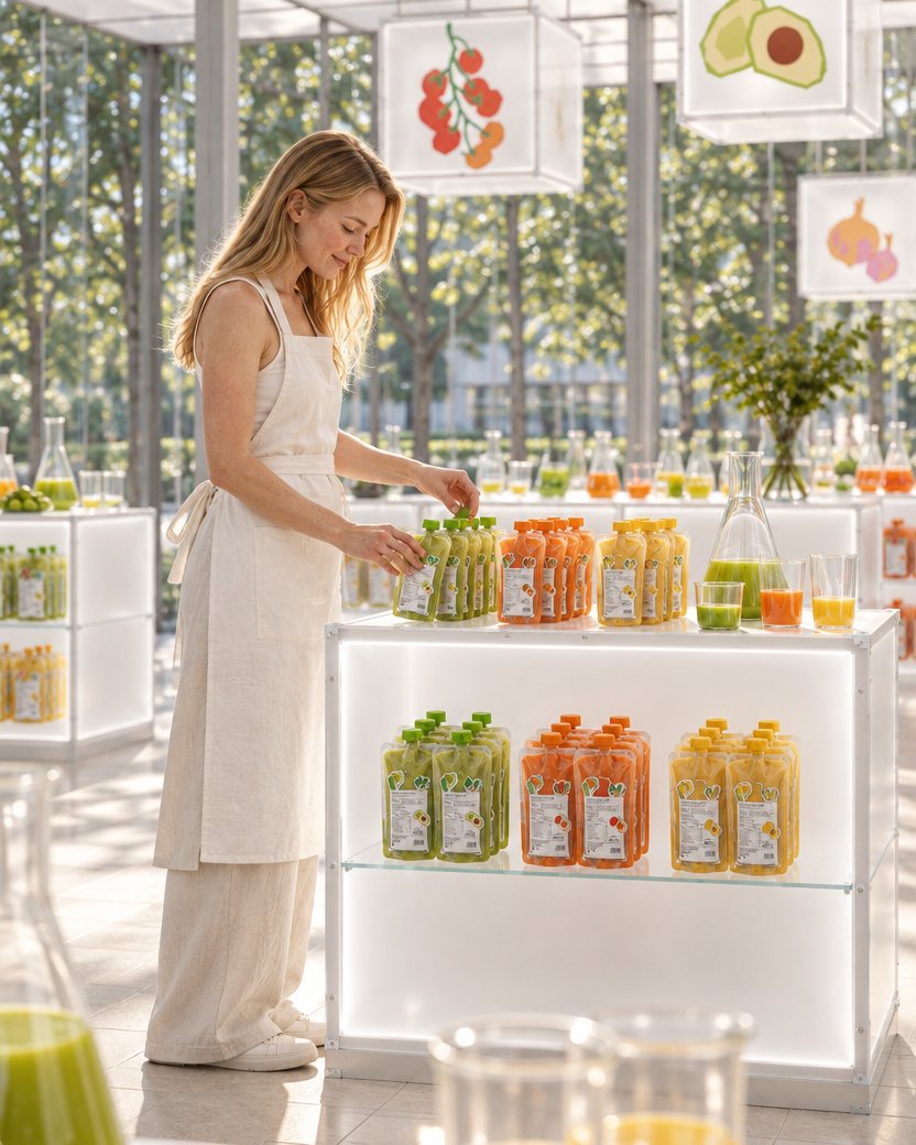
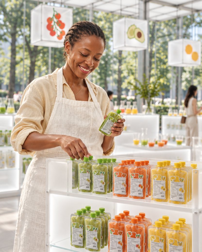
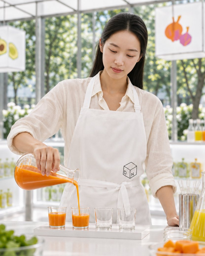
The renders carry the brand's character: models look natural and fresh, suggesting an easy, healthy, happy way of living rather than studied luxury. Product shots draw on laboratory props and the raw ingredients, with lighting and backgrounds tuned to the brand's tone, and show the pouches in everyday life and at work.
03 Store Design
03 Store Design
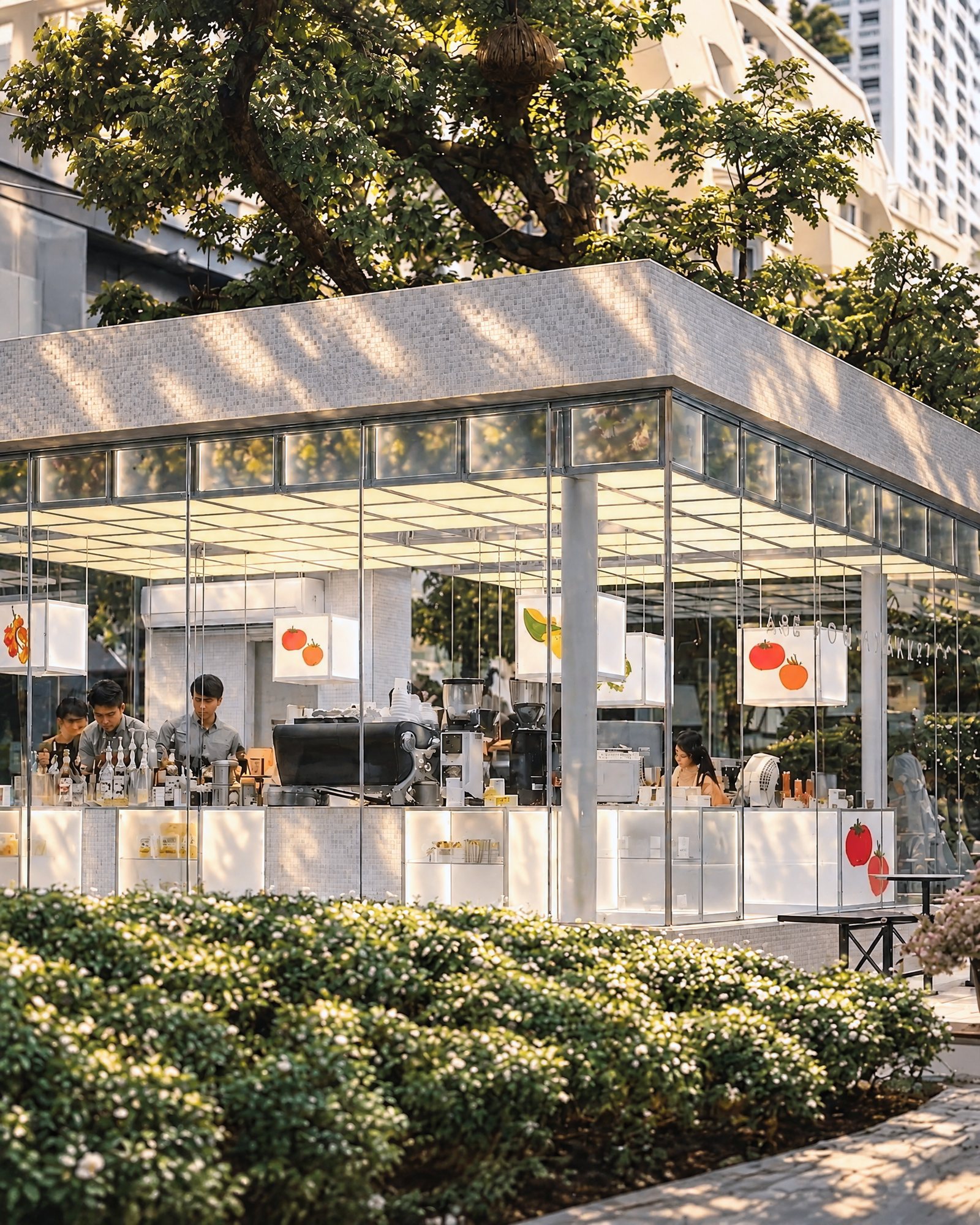
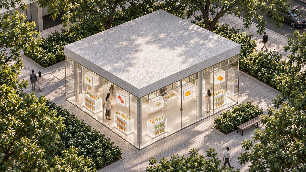
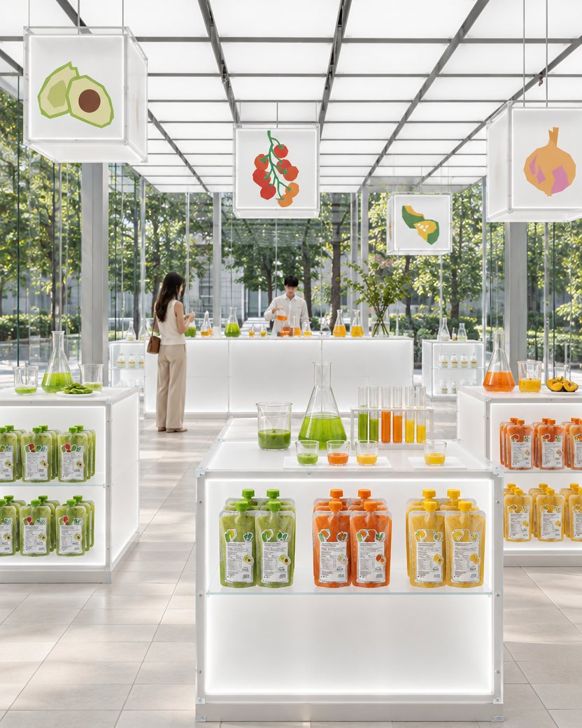
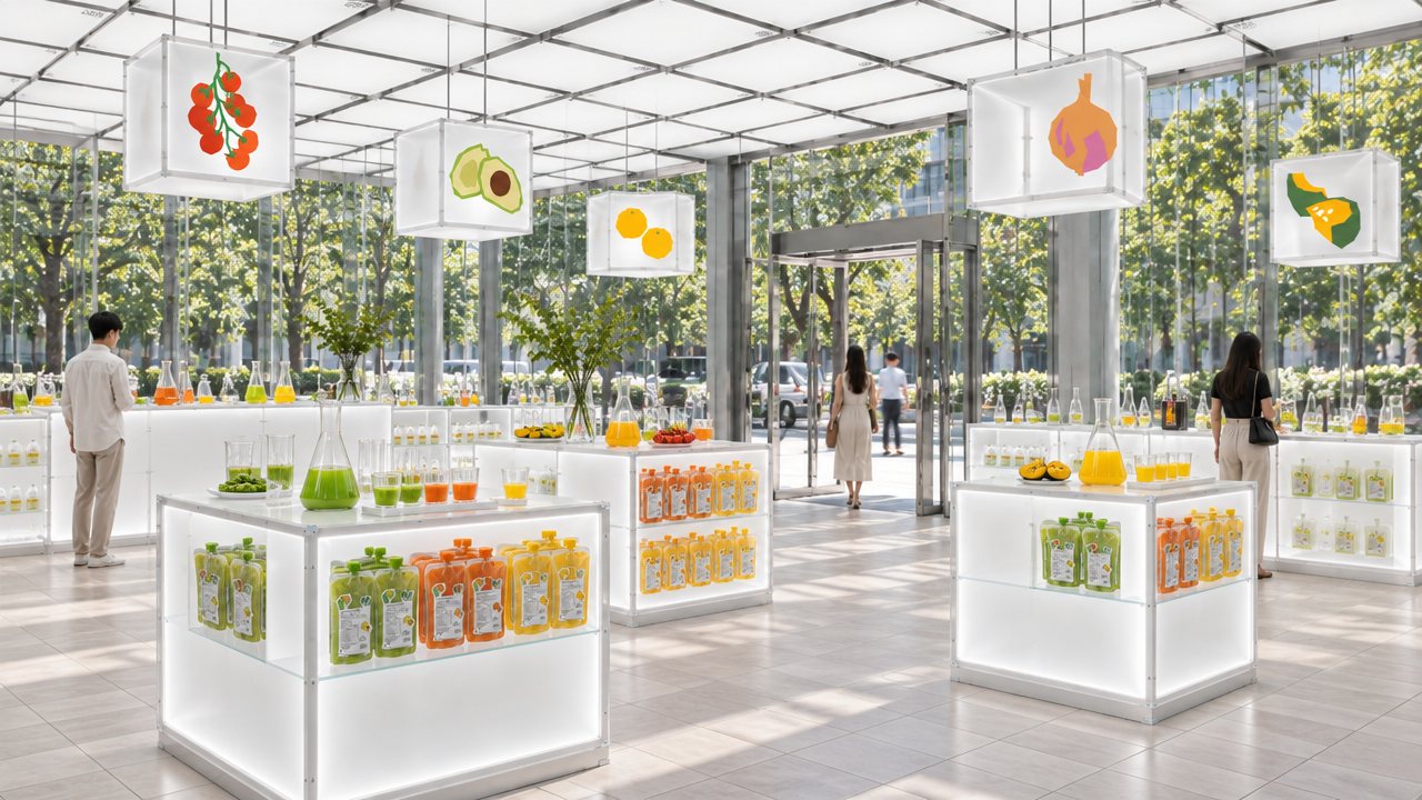
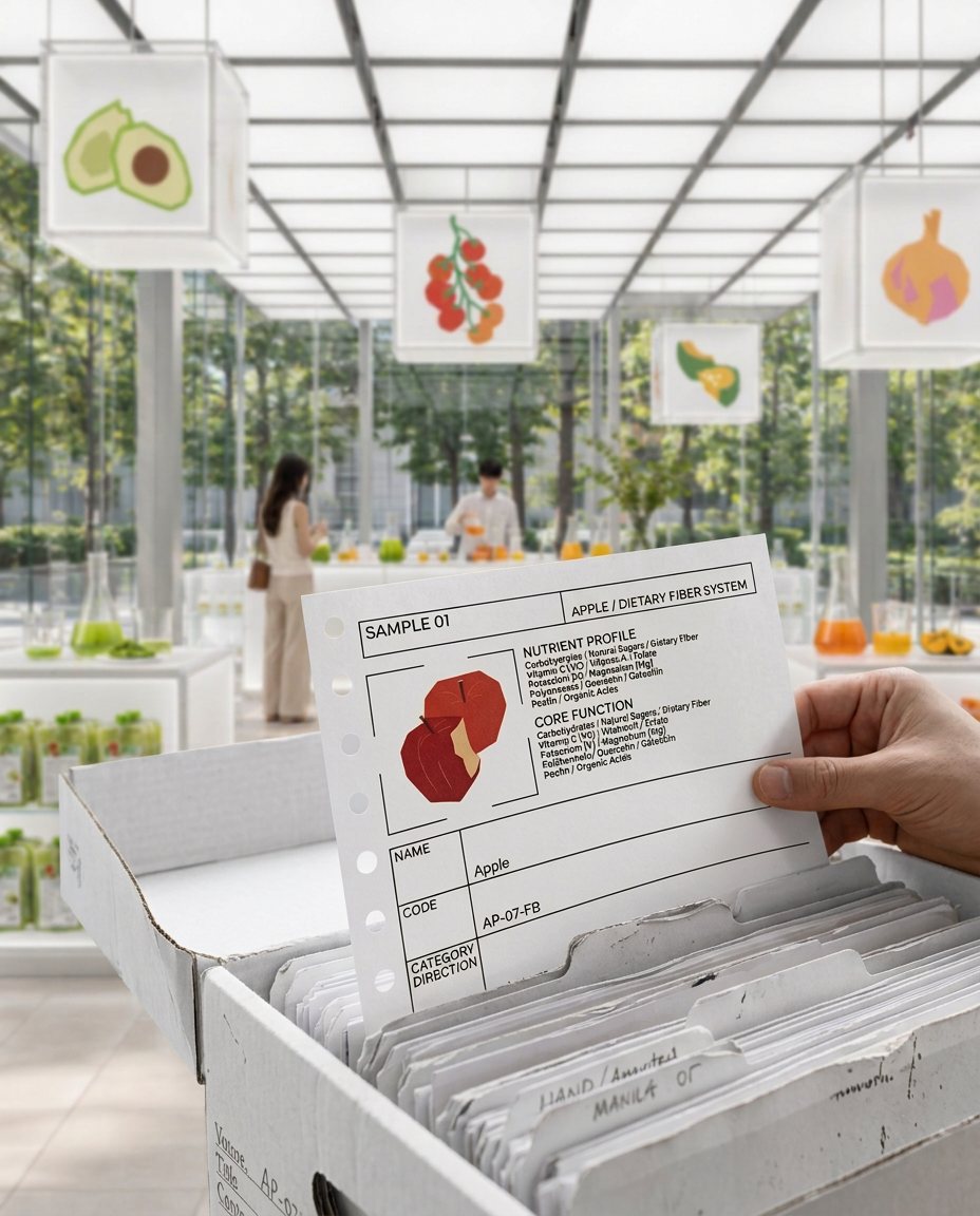
The store follows the logic of the cube, combining silver metal frames, glass and cement mosaic to keep the brand rigorous, scientific and restrained, while coloured purées and fruit motifs run through cube-built pendant lights and display stands. Beakers and test tubes in the displays carry the laboratory idea into the space.
04 Brand Peripheral Design
04 Brand Peripheral Design
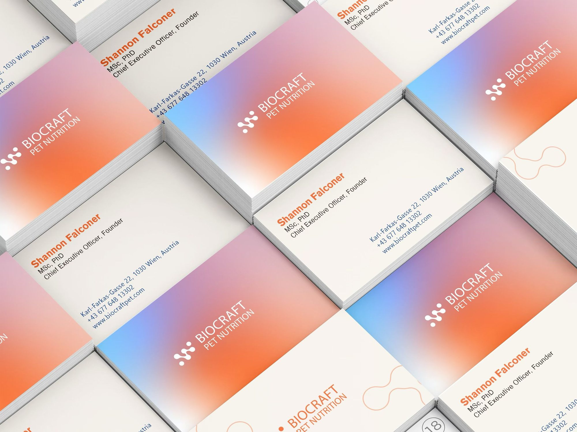
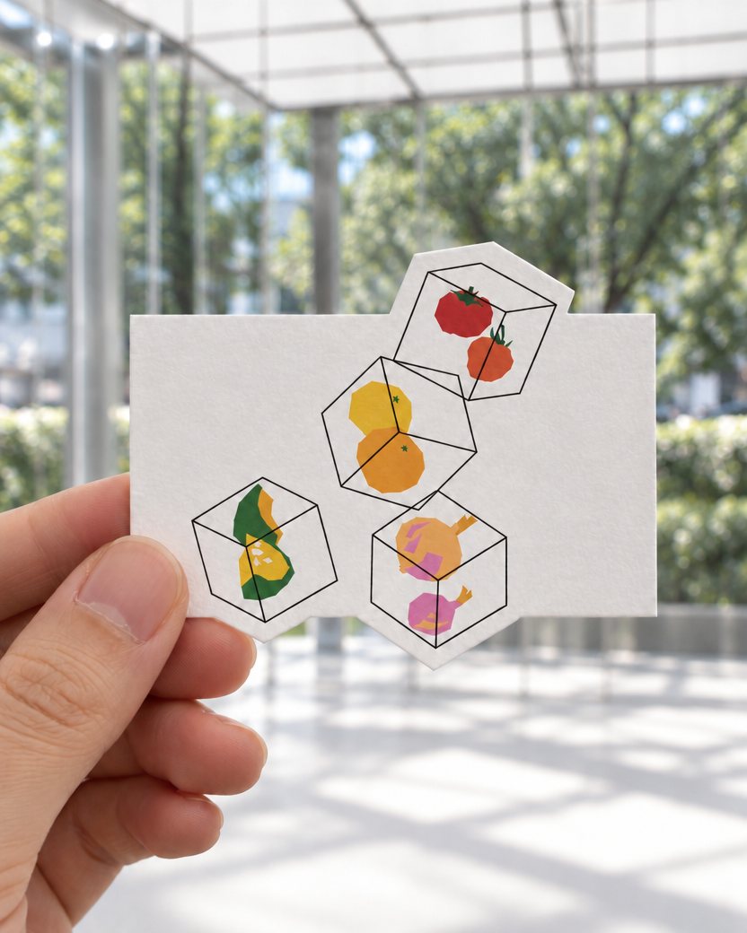
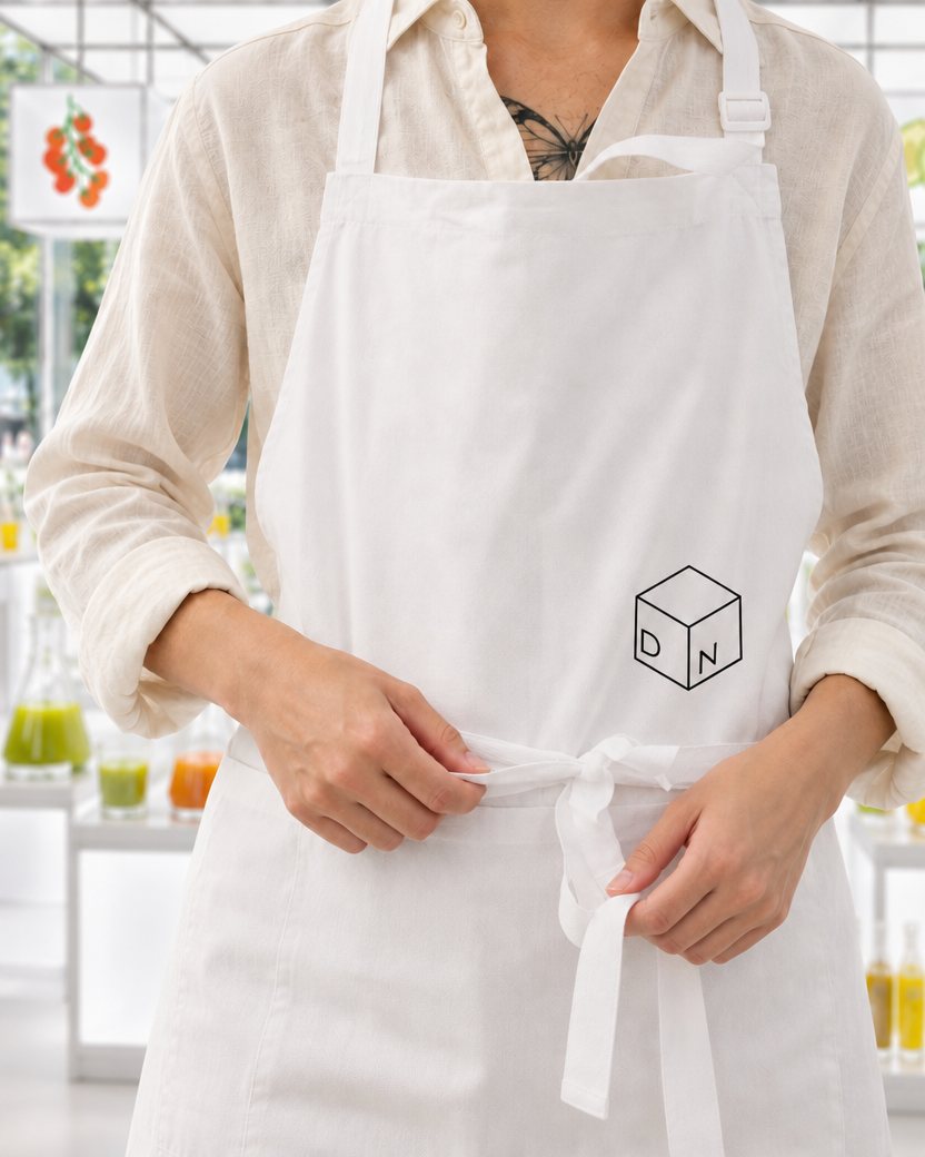
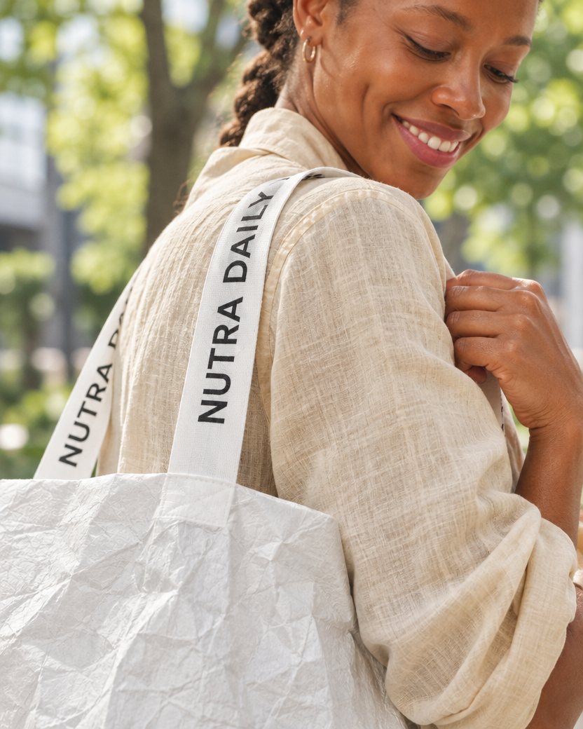
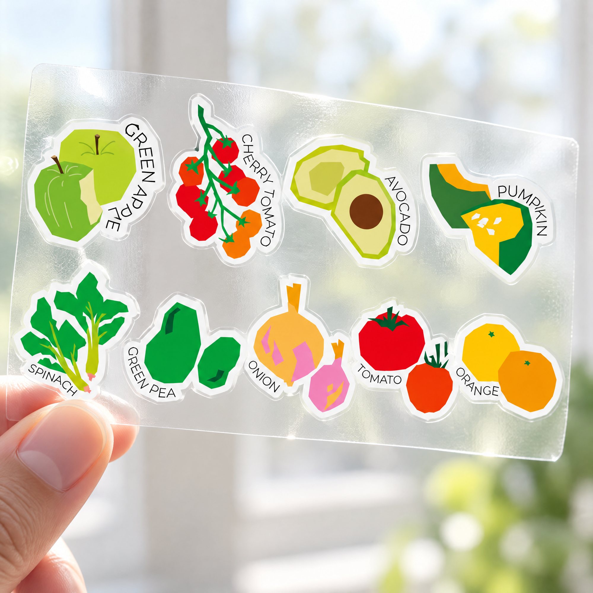
The tote bag, apron, business cards, stickers and coasters all grow out of the same visual system.
05 Brand Book Design
05 Brand Book Design
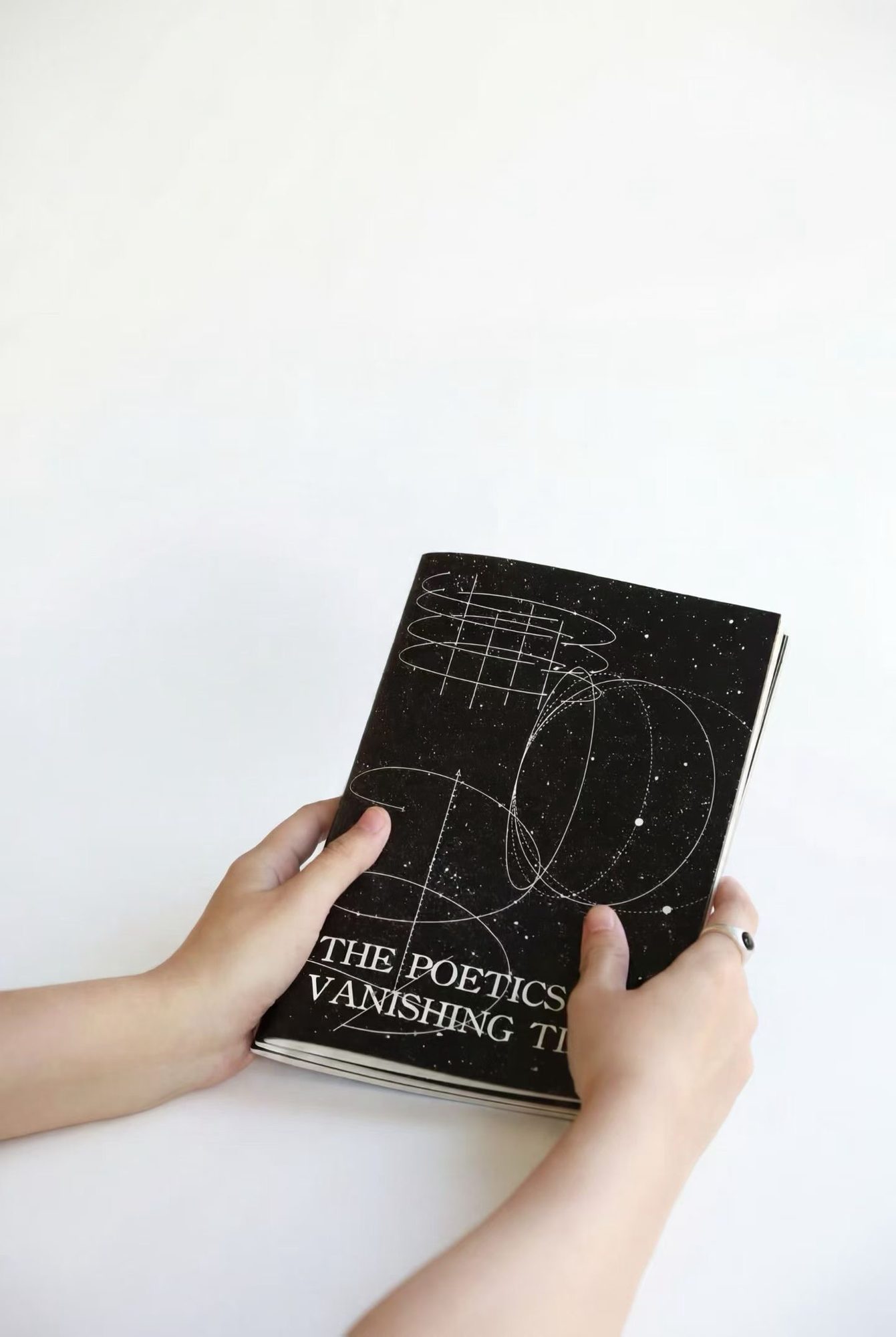
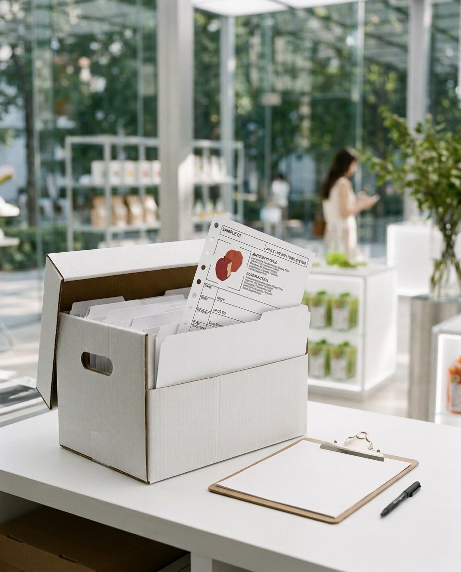
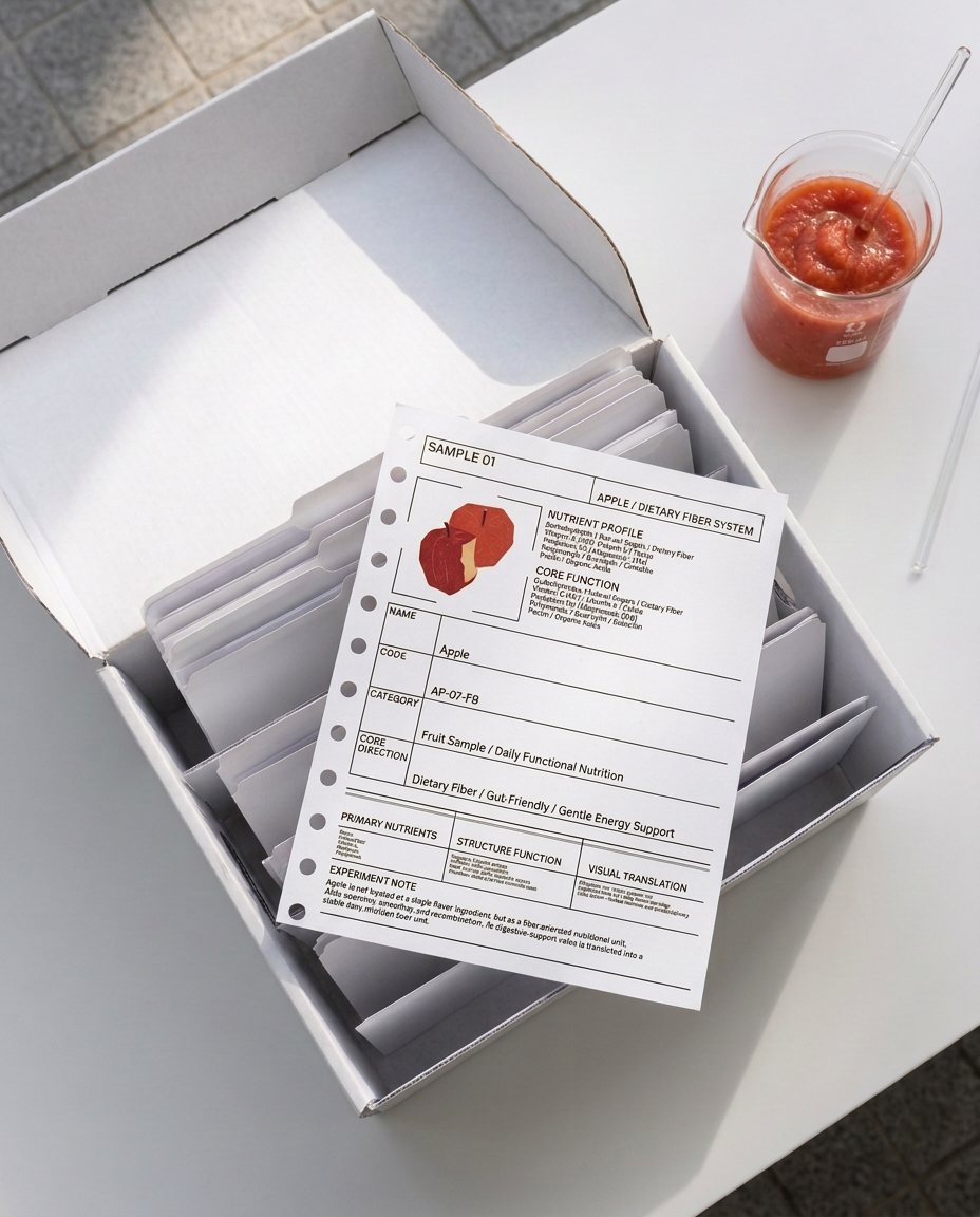
The brand book takes the form of a fruit archive: each ingredient has its own file, with its origin and precise nutritional data, keeping the rigour of the lab.
06 Poster Design
06 Poster Design
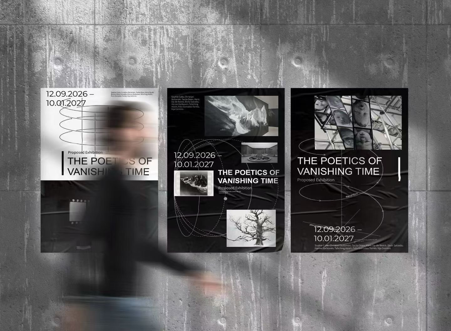
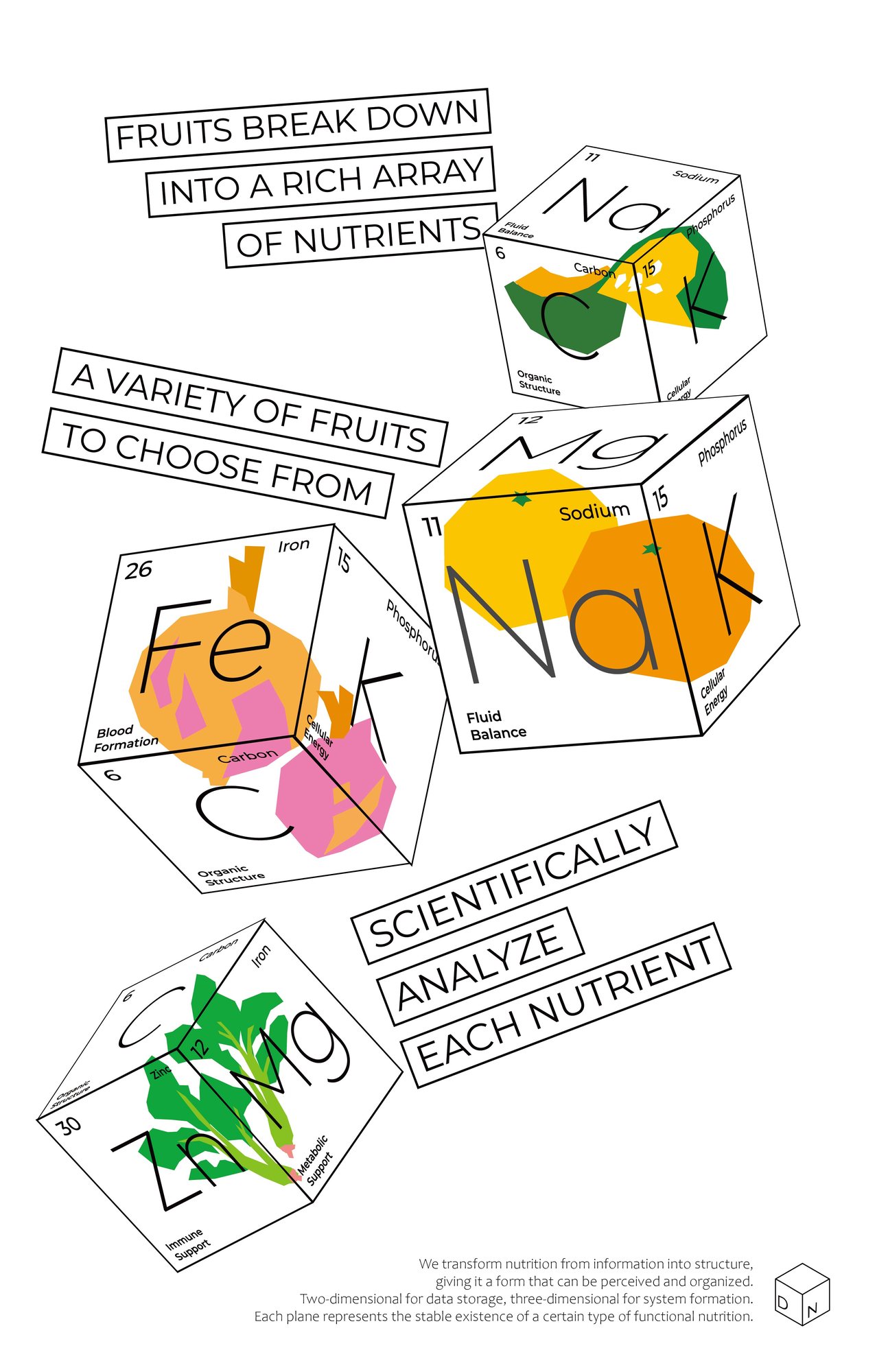
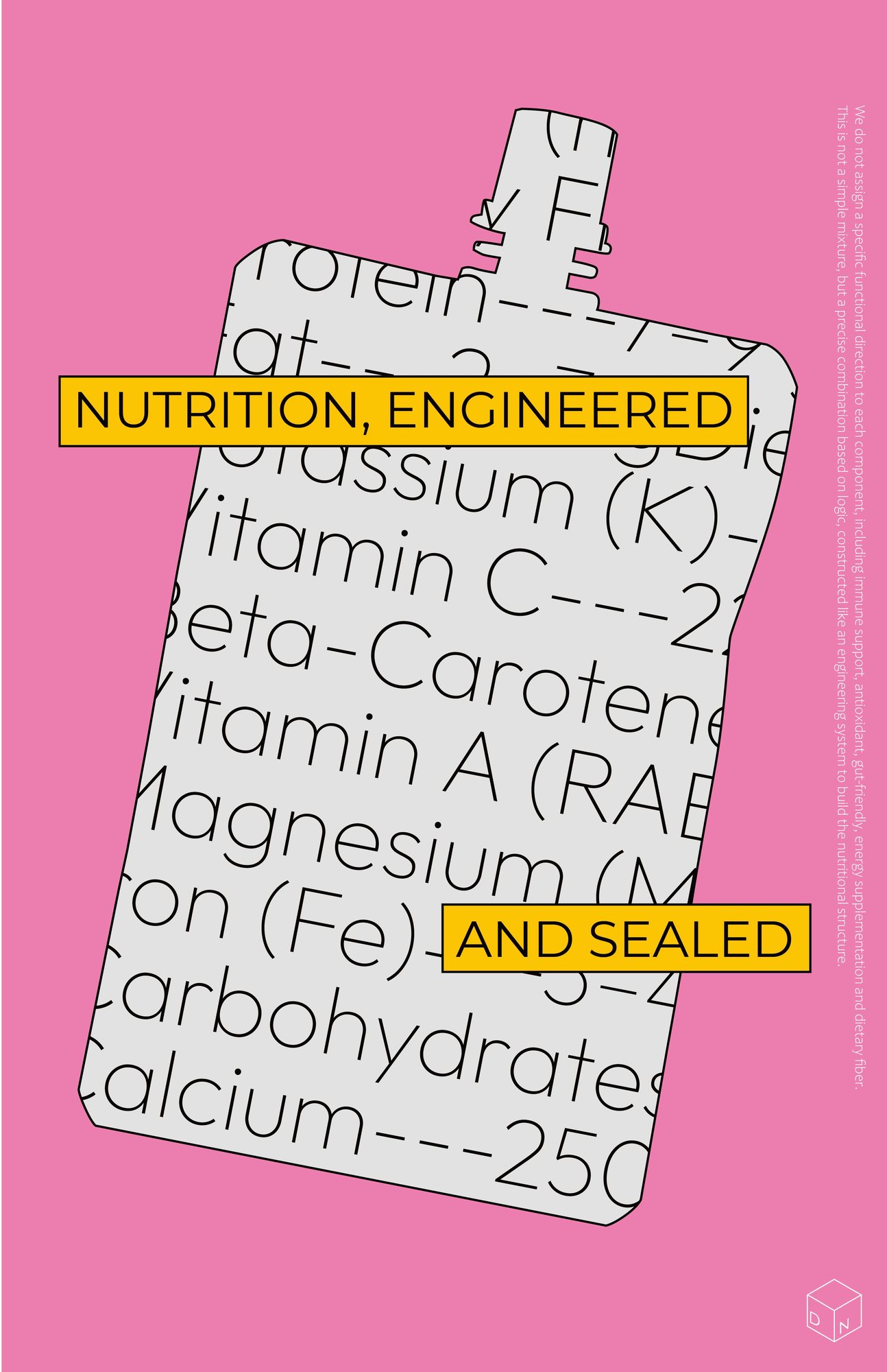
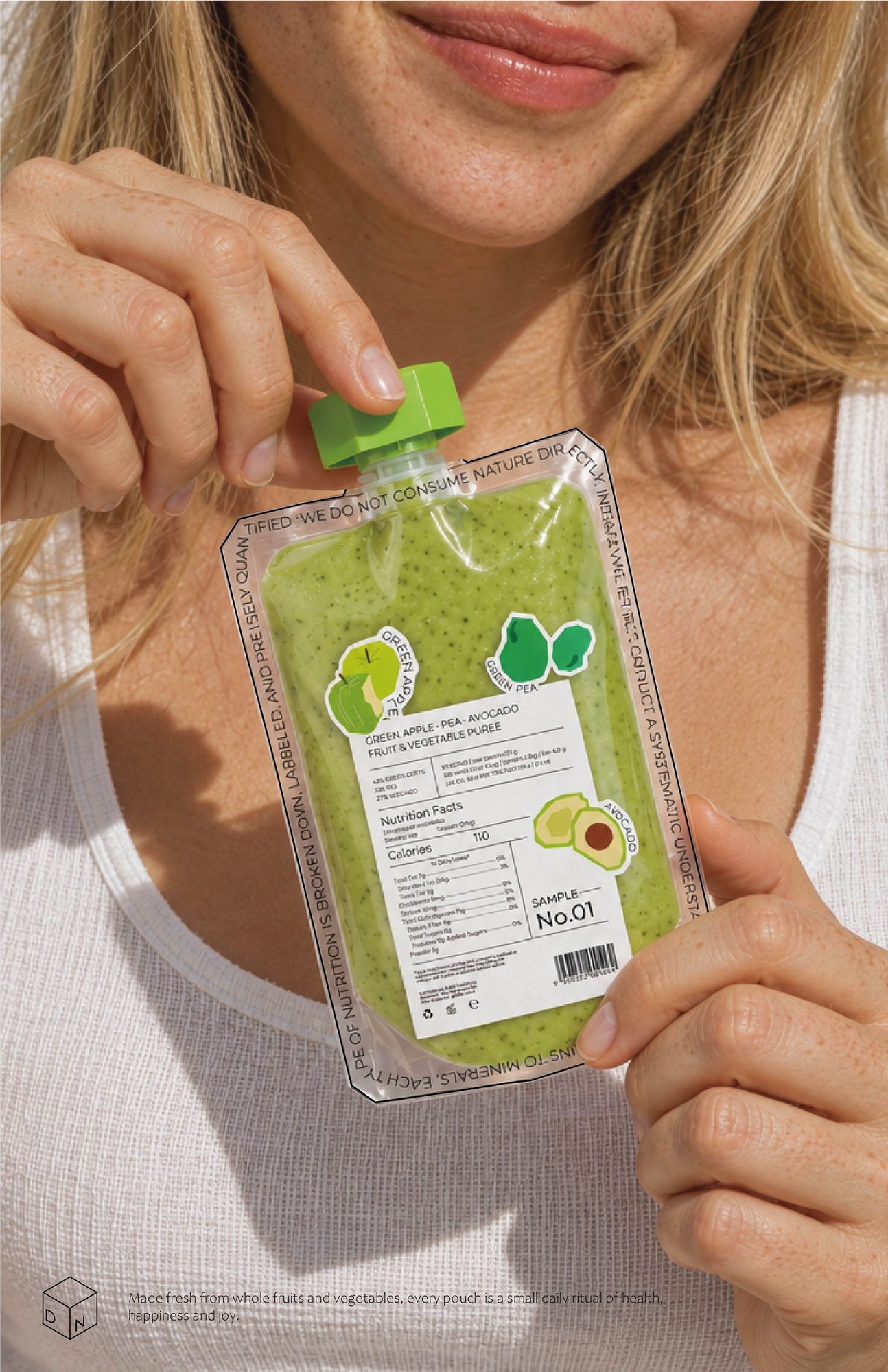
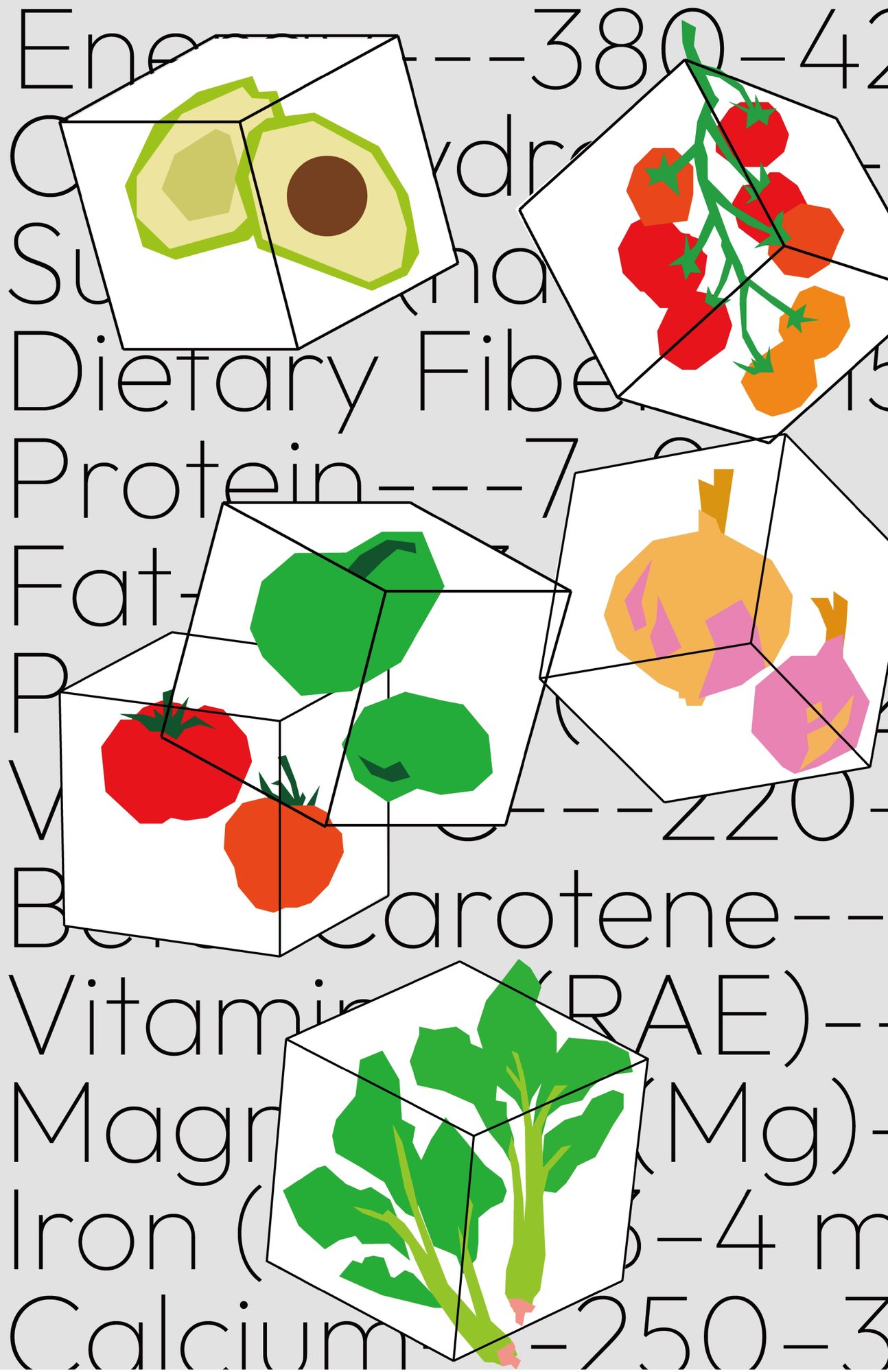
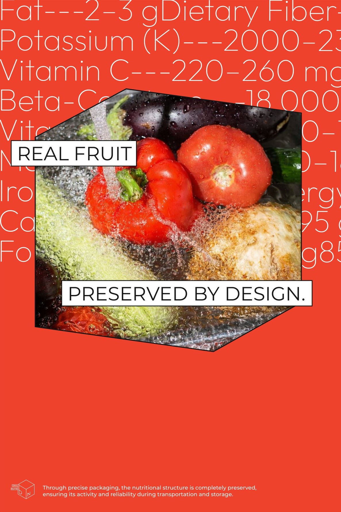
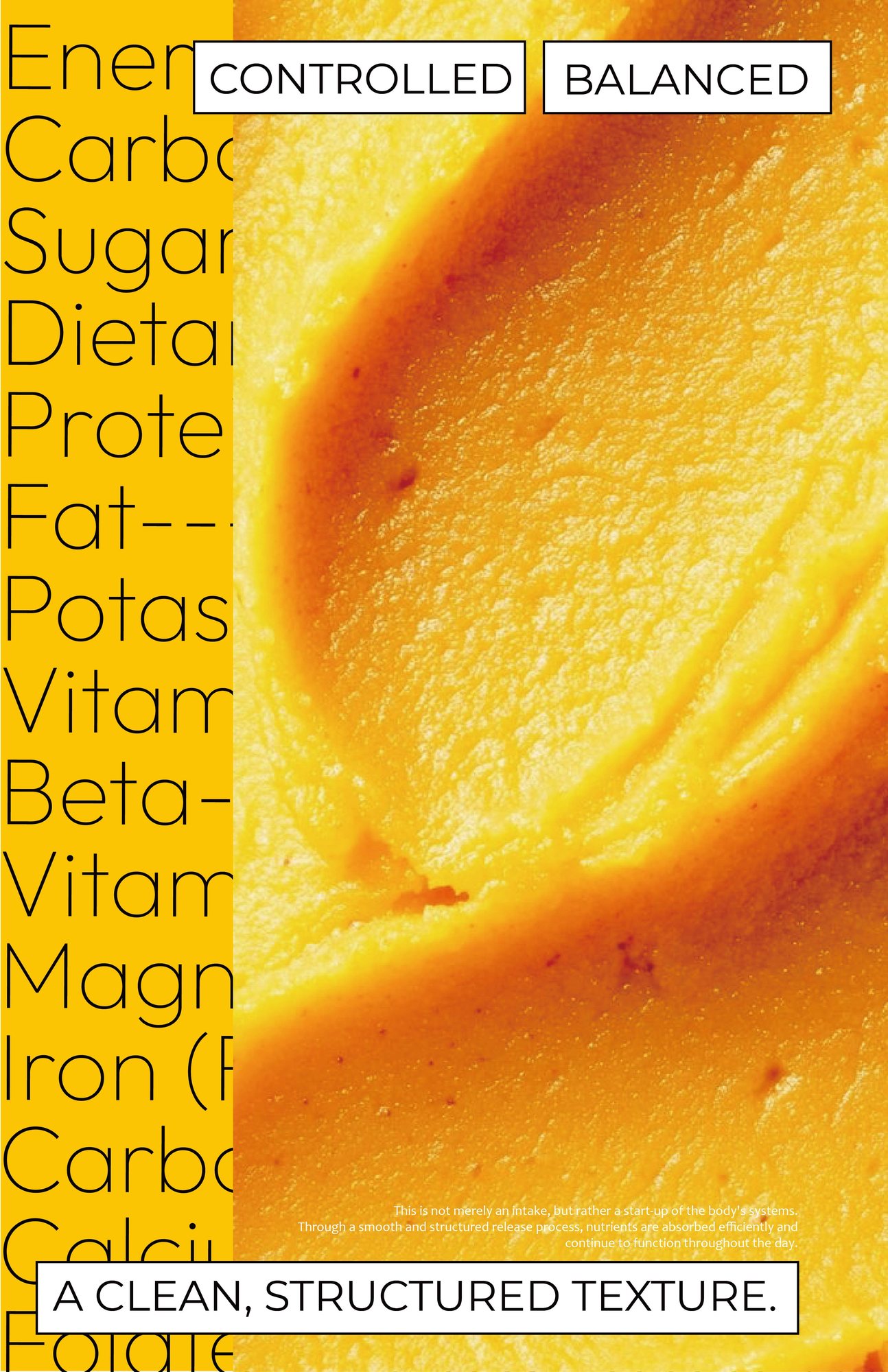
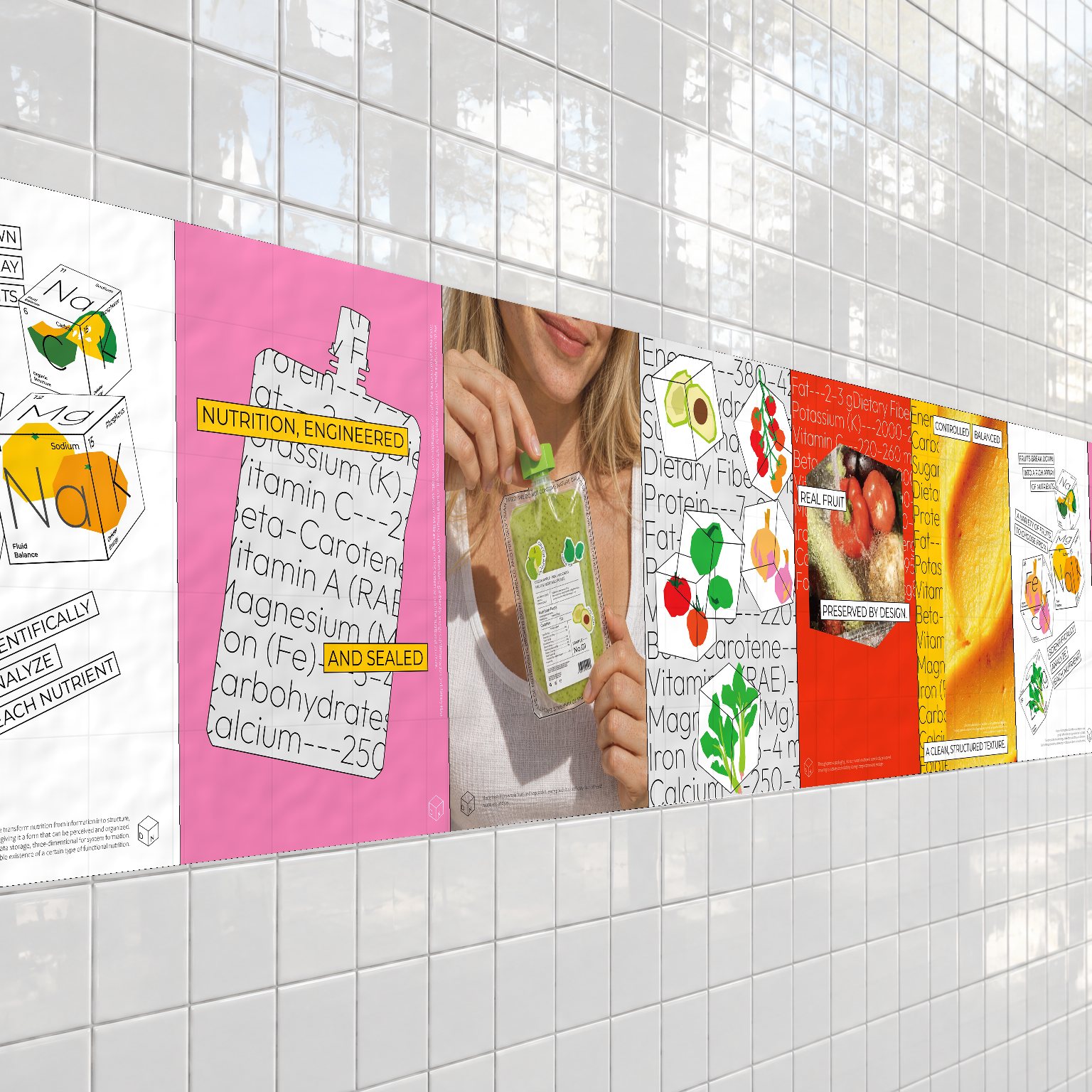
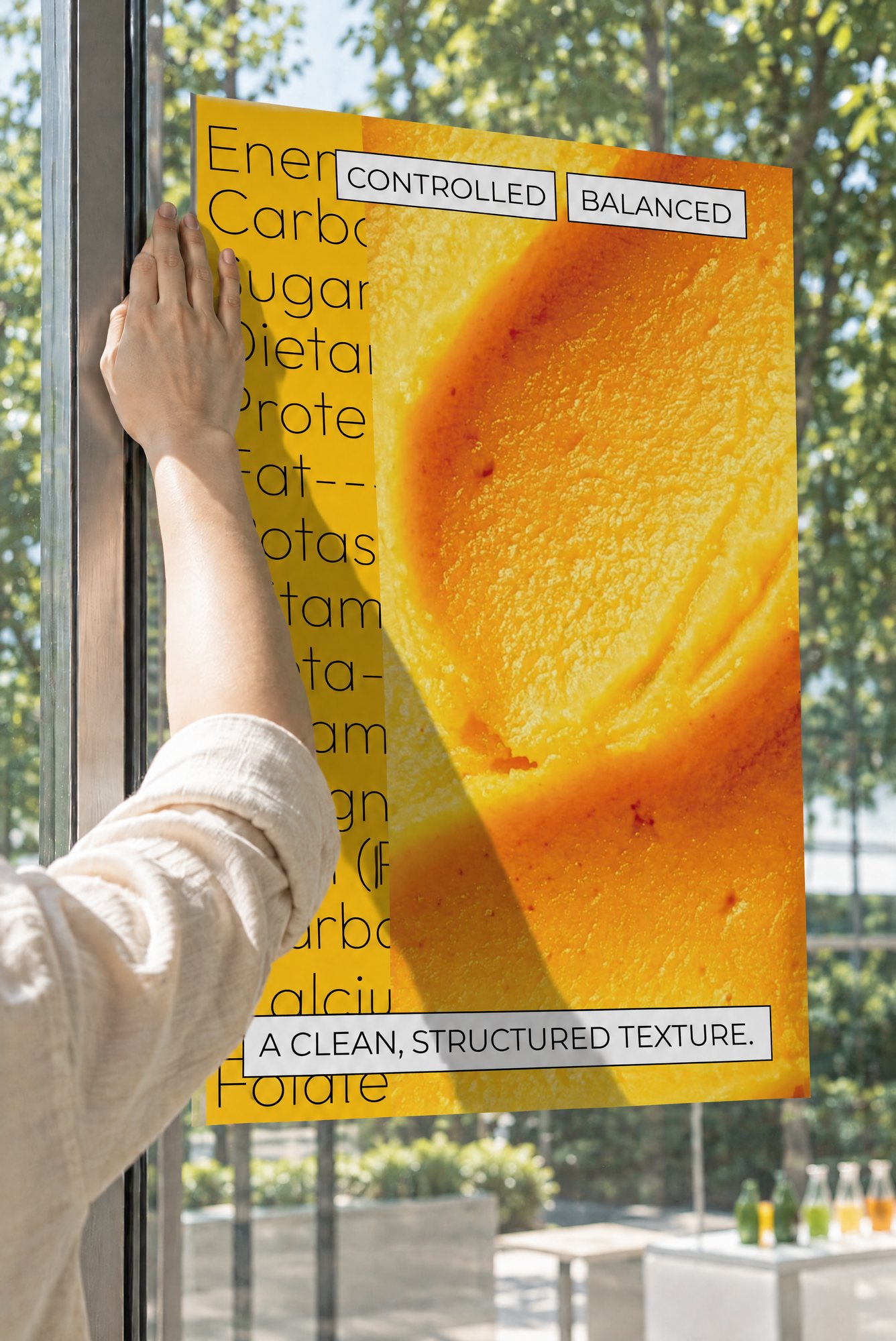
The posters show the visual system at full range, combined with real photography to keep the brand's look unified.
07 AI Workflow
07 AI Workflow
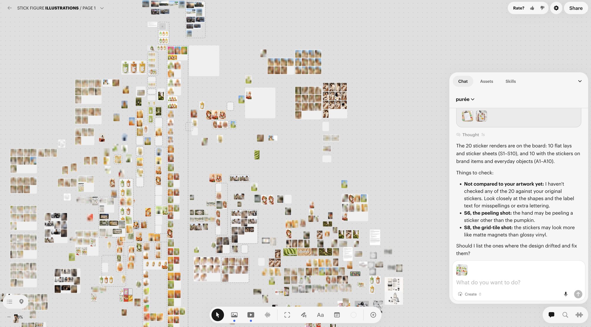
In the AI workflow I ran extensive image tests and adjustments, pushing for the finest detail to keep quality high and the brand's atmosphere consistent.